Analysis of COVID-19 Mortality
TARGET.cases <- "time_series_covid19_confirmed_global.csv"
TARGET.deaths <- "time_series_covid19_deaths_global.csv"
SURL <- "https://github.com/CSSEGISandData/COVID-19/raw/master/csse_covid_19_data/csse_covid_19_time_series"
## To download the latest version, delete the files and run again
for (target in c(TARGET.cases, TARGET.deaths))
{
	if (!file.exists(target))
        download.file(sprintf("%s/%s", SURL, target), destfile = target)
}
covid.cases <- read.csv(TARGET.cases, check.names = FALSE, stringsAsFactors = FALSE)
covid.deaths <- read.csv(TARGET.deaths, check.names = FALSE, stringsAsFactors = FALSE)
if (!identical(dimnames(covid.cases), dimnames(covid.deaths)))
    stop("Cases and death data have different structure... check versions.")
keep <- covid.deaths[[length(covid.deaths)]] > 100 # at least 100 deaths
covid.cases <- covid.cases[keep, ]
covid.deaths <- covid.deaths[keep, ]
[This note was last updated using data downloaded on 2020-10-03. Here is the source of this analysis. Click here to show / hide the R code used. ]
To understand how the COVID-19 pandemic has spread over time in various countries, the number of cases (or deaths) over time is not necessarily the best quantity to visualize. Instead, we have used the doubling time, which is the number of days it took for the total number of cases to reach the current number from when it was half the current number. The doubling time is a measure of the rate of growth: if it does not change with time in a country, the number of cases is growing exponentially. With measures to control spread, the doubling time should systematically increase with time.
Another very important aspect of the COVID-19 pandemic is its mortality rate. That is, once an individual is infected, how likely is he/she to die? This of course depends on various attributes of the individual such as age and other underlying conditions, but even a crude (marginal) country-specific mortality rate is rather difficult to estimate.
The problem with the naive death rate estimate
The main difficulty is in knowing the size of the vulnerable population. Although it is possible that deaths due to COVID-19 are not attributed to it, this is not very likely to happen, especially in countries where the virus has already spread enough to cause a substantial number of deaths. On the other hand, the reported number of confirmed cases may only be a fraction of the true number of cases, either due to lack of testing, or changes in testing protocols, or various other reasons. Thus, the best we can hope for is to estimate the mortality rate among identified cases.
There is yet another problem. The cumulative daily number of confirmed cases and deaths are avaiable (e.g., from JHU CSSE on Github), and one could naively estimate the mortality rate by dividing the (current) total number of deaths by the total number of infections. However, doing this will always underestimate the mortality rate, because the denominator contains (many) recently diagnosed patients that have not yet died, but many of whom will actually die. As pointed out here, the correct way to estimate the death rate is to consider only closed cases (confirmed cases who have either died or been cured). But that data is not easily available (the number of recovered patients by date is available, but that is not enough).
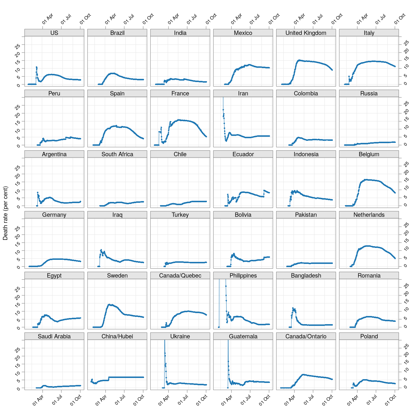
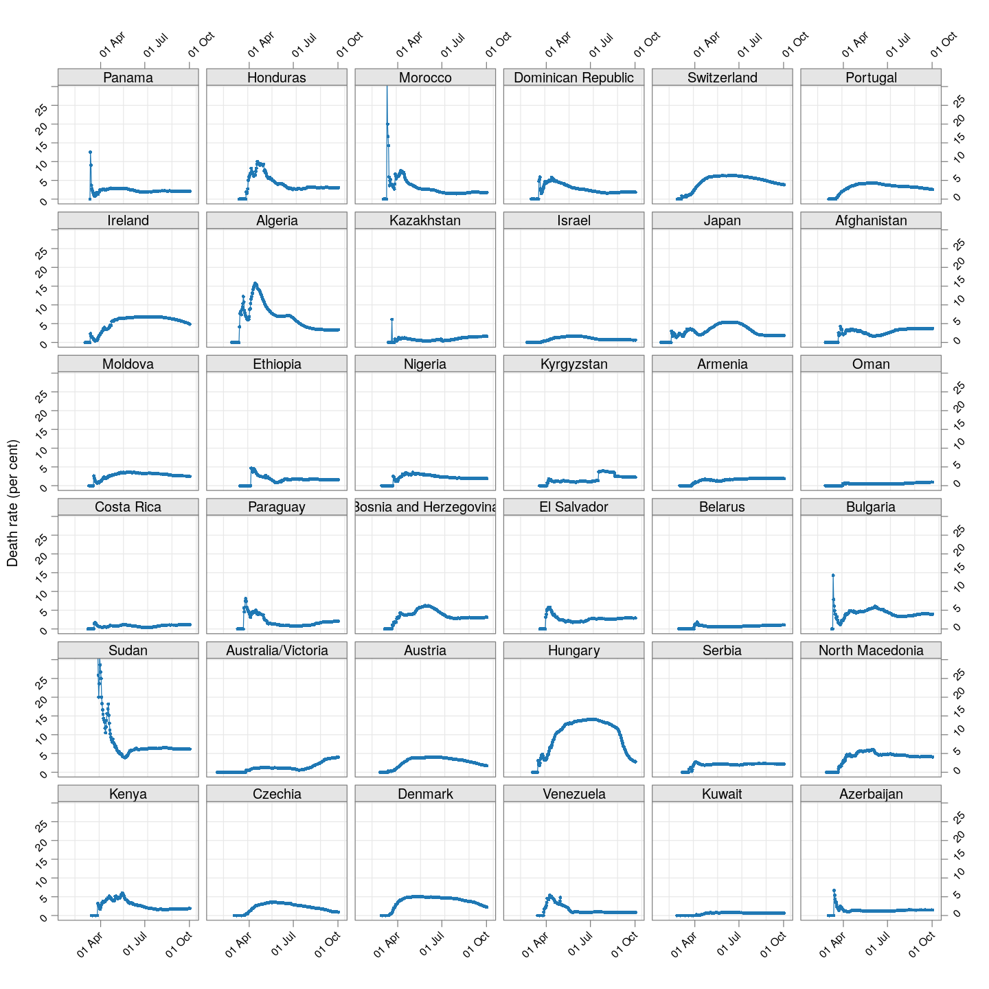
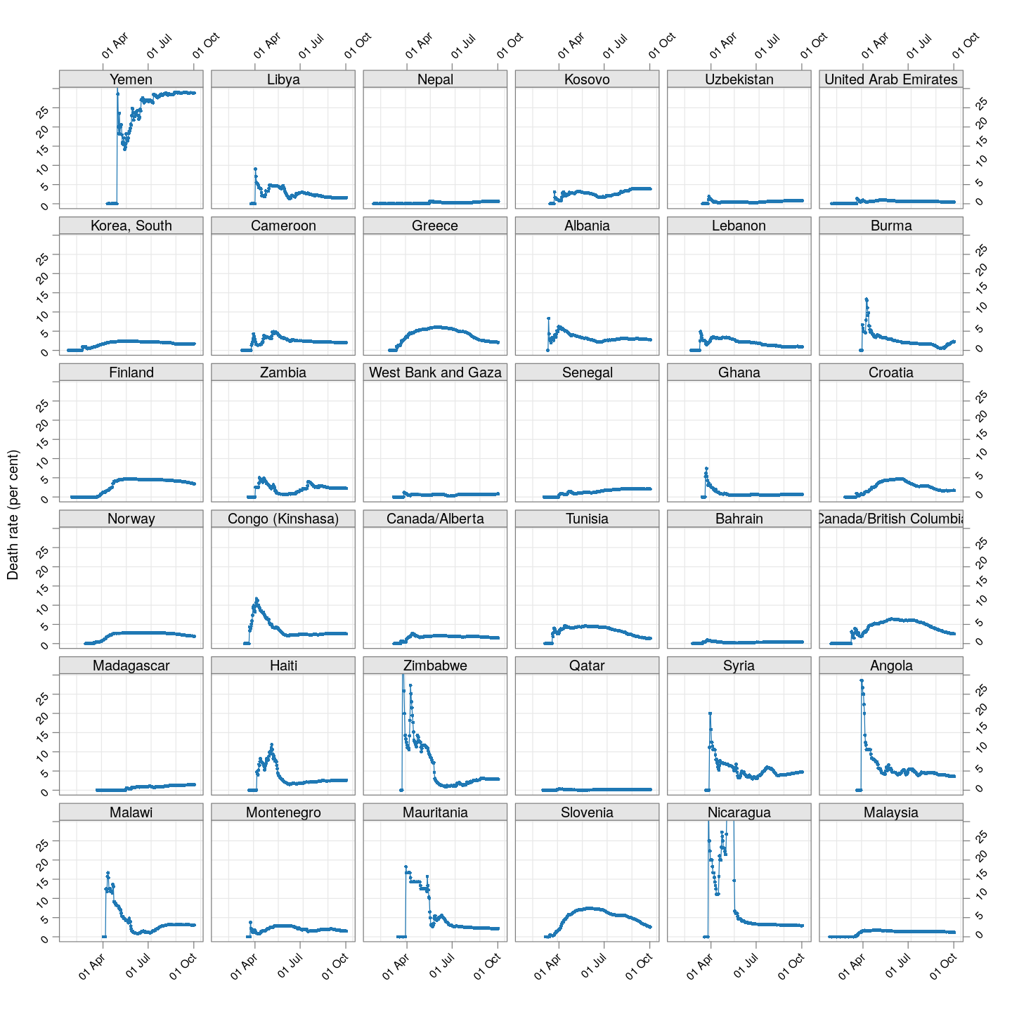
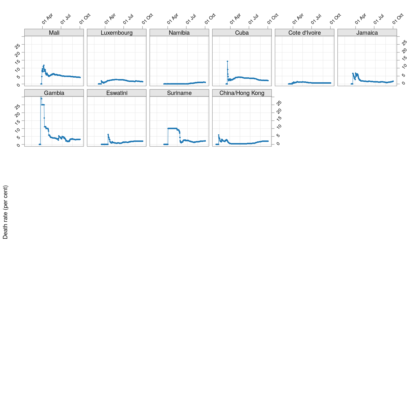
The plot below shows how the naive death rates (proportion of deaths over number of confirmed cases), on any given day, have changed over time for countries with at least 100 deaths.1 Although the estimate is eventually (asymptotically) supposed to stabilize (as the fraction of “active” cases decreases), this has clearly not happened yet for most countries.
correctLag <- function(x)
{
    n <- length(x)
    stopifnot(n > 2)
    for (i in seq(2, n-1))
        if (x[i] == x[i-1])
            x[i] <- sqrt(x[i-1] * x[i+1])
    x
}
extractCasesTS <- function(d)
{
    x <- t(data.matrix(d[, -c(1:4)]))
    x[x == -1] <- NA
    colnames(x) <-
        with(d, ifelse(`Province/State` == "", `Country/Region`,
                       paste(`Country/Region`, `Province/State`,
                             sep = "/")))
    apply(x, 2, correctLag)
}
xcovid.cases <- extractCasesTS(covid.cases)
xcovid.deaths <- extractCasesTS(covid.deaths)
D <- nrow(xcovid.deaths)
total.deaths <- xcovid.deaths[D, , drop = TRUE]
porder <- rev(order(total.deaths))
death.rate <- 100 * (xcovid.deaths / xcovid.cases)
dr.naive.latest <- death.rate[D, , drop = TRUE]
start.date <- as.Date("2020-01-22")
xat <- pretty(start.date + c(0, D-1))
(dr.naive <-
     xyplot(ts(death.rate[, porder], start = start.date),
            type = "o", grid = TRUE, layout = c(6, 6),
            par.settings = simpleTheme(pch = 16, cex = 0.5),
            scales = list(alternating = 3, rot = 45,
                          x = list(at = xat, labels = format(xat, format = "%d %b")),
                          y = list(relation = "same")),
            xlab = NULL, ylab = "Death rate (per cent)",
            as.table = TRUE, between = list(x = 0.5, y = 0.5),
            ylim = extendrange(range(tail(death.rate, 10))))
)
The lag-adjusted death rate
A very simple alternative is to assume that the correct denominator for the proportion of deaths of not the current number of cases, but rather the number of cases a few days ago (representing the population of patients that would have died by now if they were to die at all).
But what should that lag be? We know that two weeks is probably long enough (probably too long), but otherwise we do not have enough information to guess. So, we tried lags of one day, two days, three days, and so on, and finally settled on a lag of 7 days because it is the smallest lag for which the lag-adjusted death rate stabilized in Hubei (China); being the region with the longest history, we expect it to give the most stable estimate. The following plot shows how this lag-adjusted death rates has changed over time, and compares it with the naive death rate.
LAG <- 7 # lowest lag for which Hubei estimates flatten out
death.rate <- 100 * tail(xcovid.deaths, -LAG) / head(xcovid.cases, -LAG)
dr.adjusted.latest <- tail(death.rate, 1)
start.date <- as.Date("2020-01-22") + LAG
xat <- pretty(start.date + c(0, nrow(death.rate)-1))
dr.adjusted <-
     xyplot(ts(death.rate[, porder], start = start.date),
            type = "o", layout = c(6, 6),
            par.settings = simpleTheme(pch = 16, cex = 0.5),
            col = ct$superpose.symbol$col[2],
            as.table = TRUE, between = list(x = 0.5, y = 0.5),
            ylim = c(0, 30))
update(dr.naive + dr.adjusted, ylim = c(0, 30),
       auto.key = list(lines = TRUE, points = FALSE, columns = 2, type = "o",
                       text = c("Naive estimate", "One week lag-adjusted estimate")))
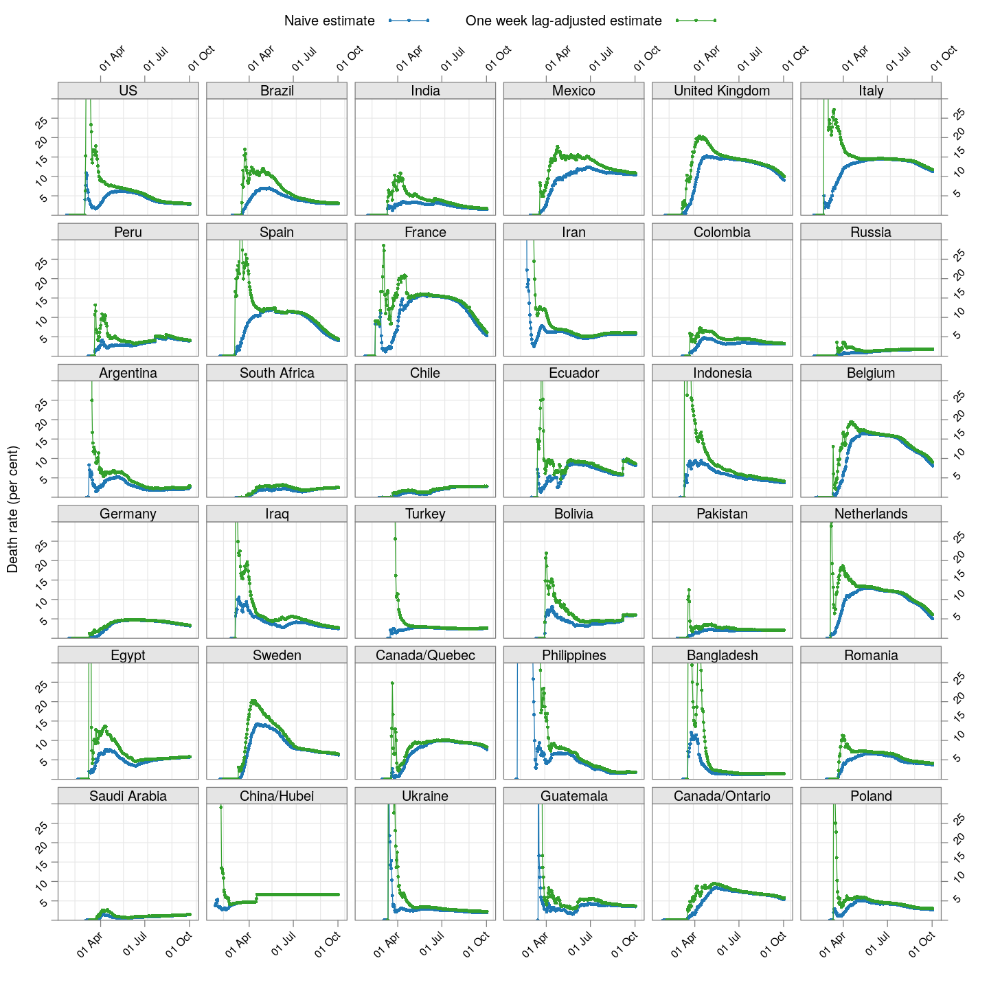
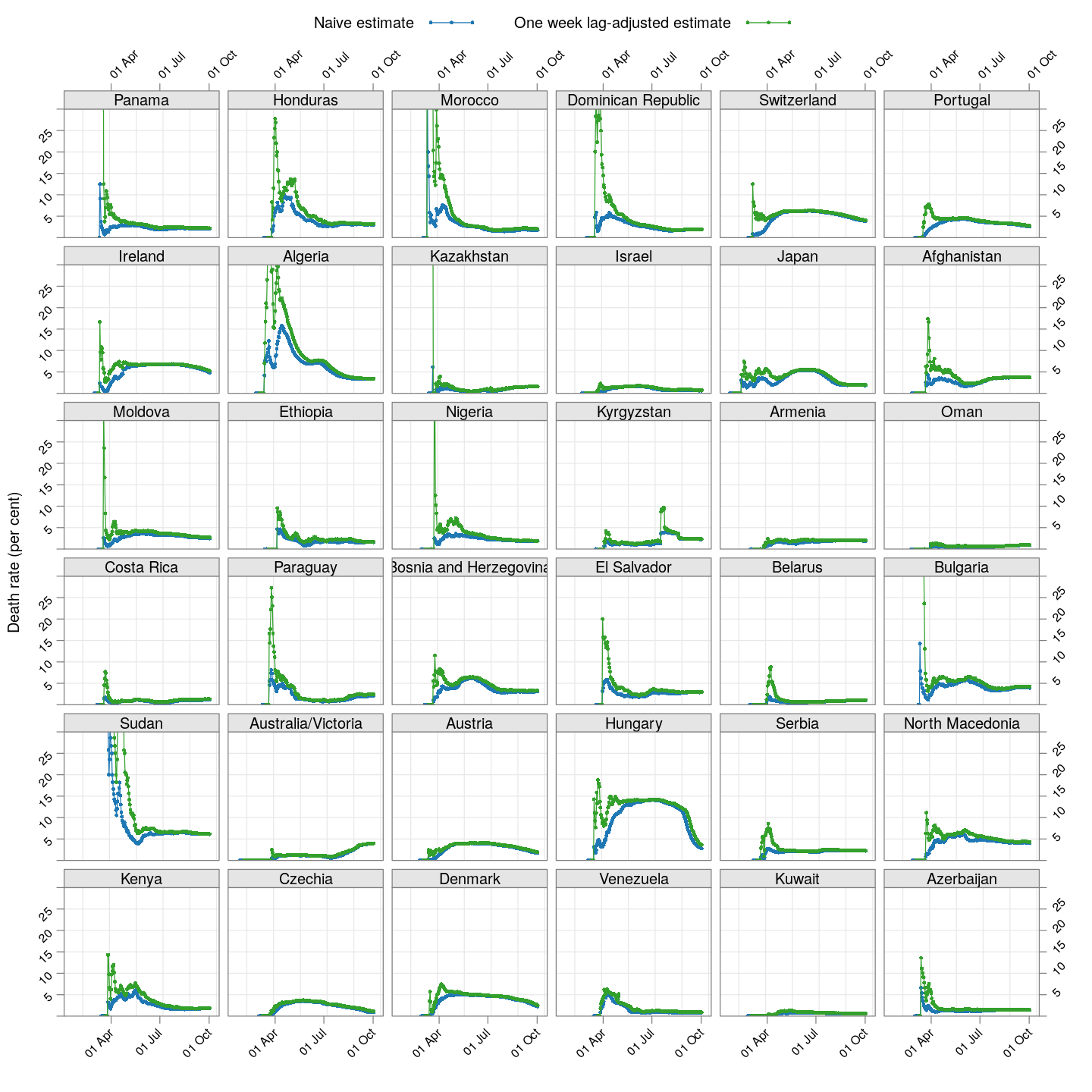
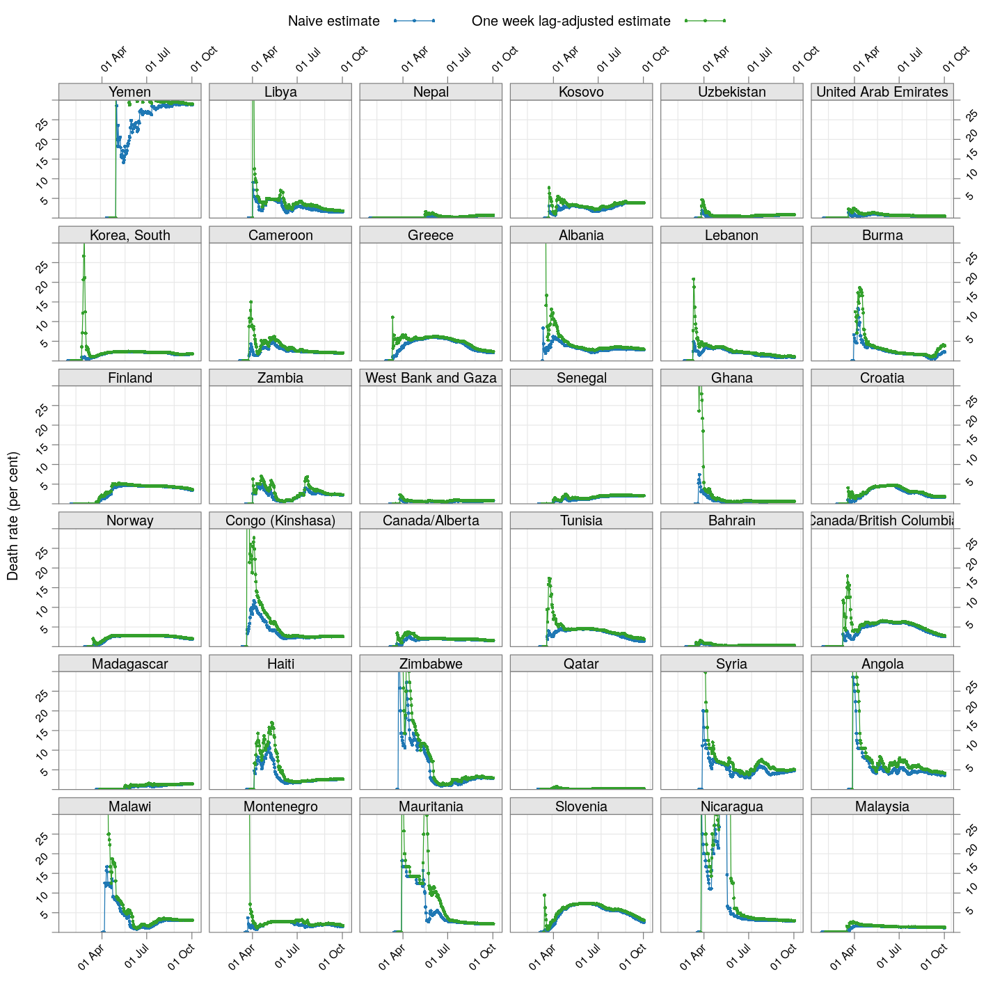
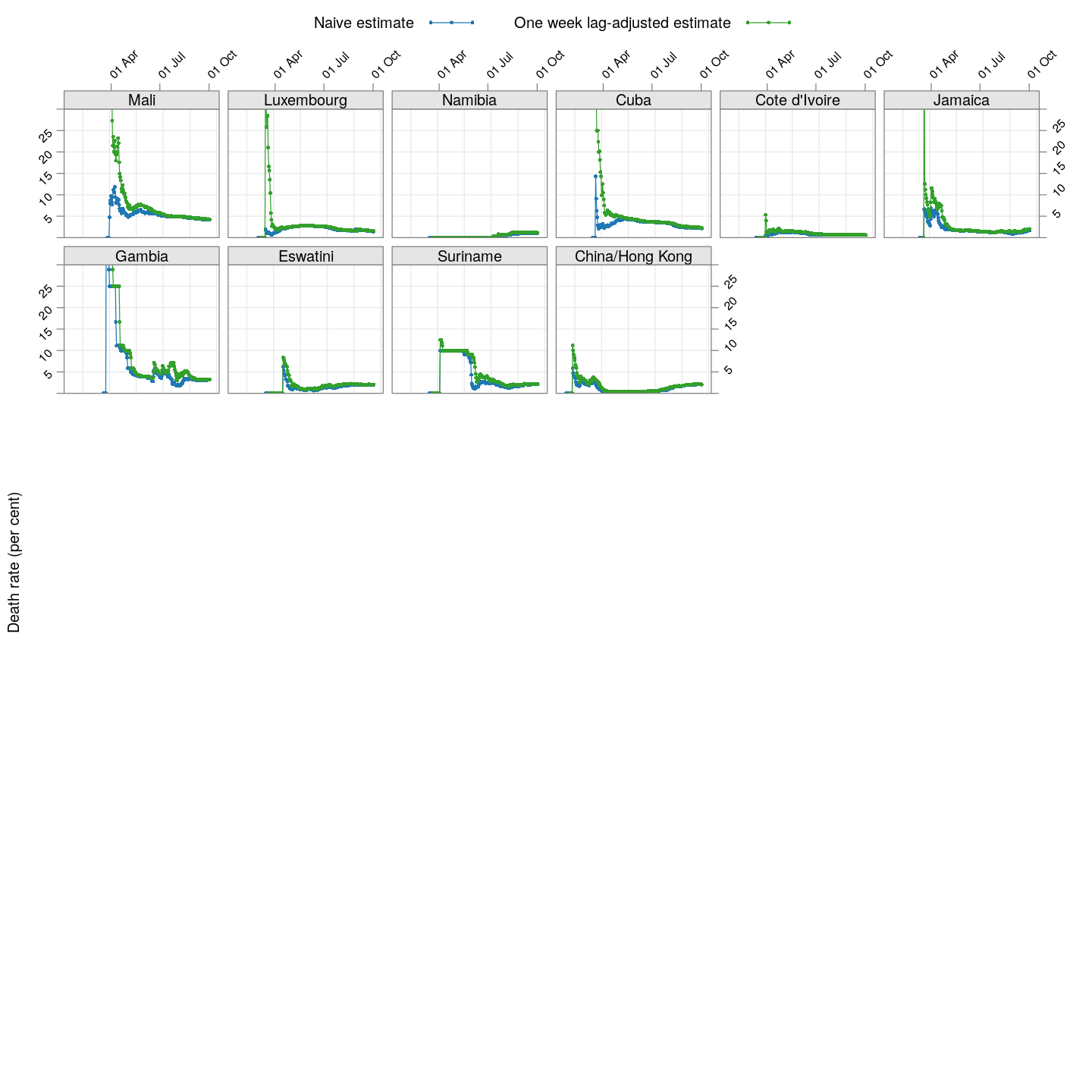
The adjusted death rates have less systematic trends than the naive estimate, but clearly there is still a lot of instability.
Why are the rates so different across countries? That is difficult to answer at this point. It possibly depends on how overwhelmed the health-care system is, but it is also important to remember that this is not the death rate among all infected individuals, but rather only among all identified individuals. In countries where possibly infected patients are not tested if their symptoms are mild, then the estimated death rate will be artificially high. Countries may also not be consistent in which deaths they are attributing to COVID-19.
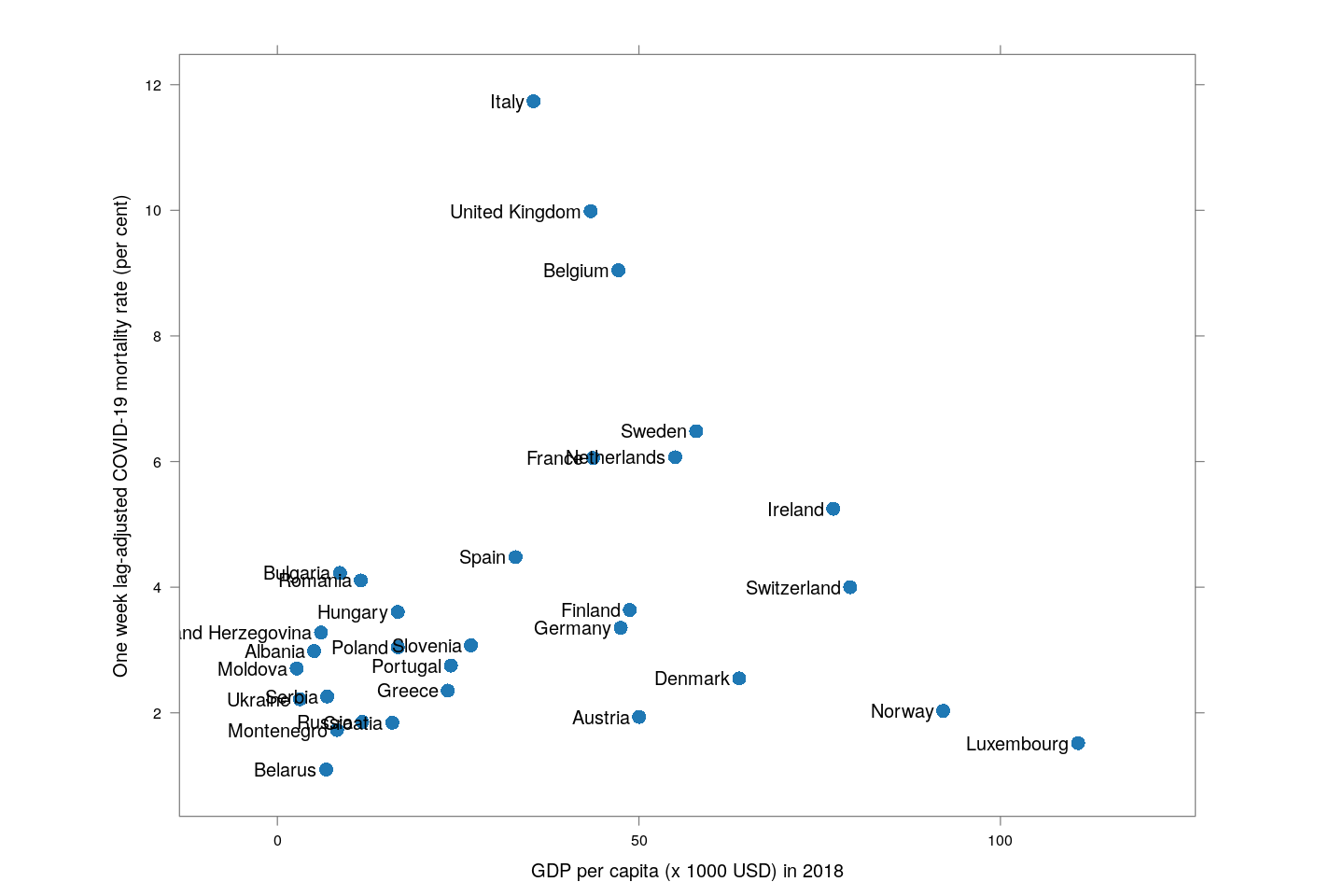
A useful, but not surprising, proxy for how efficiently a country is testing turns out to be its GDP. The following plot shows, only for European countries (which should be otherwise more or less homogeneous), the relationship between per capita GDP as of 2018 (source: World Bank) and adjusted mortality rate.
ppgdp <- read.csv("PPGDP_2018.csv") # world bank data
data(UN, package = "carData")
latest.dr <- as.data.frame(t(rbind(dr.naive.latest,
                                   dr.adjusted.latest,
                                   tail(xcovid.deaths, 1))))
names(latest.dr) <- c("naive", "adjusted", "tdeaths")
## adjust some names to match
mapNamesUN <- function(s)
{
    s[s == "US"] <- "United States"
    s[s == "Korea, South"] <- "Republic of Korea"
    s[substring(s, 1, 5) == "China"] <- "China"
    s
}
mapNamesWB <- function(s)
{
    s[s == "US"] <- "United States"
    s[s == "Iran"] <- "Iran, Islamic Rep."
    s[s == "Korea, South"] <- "Korea, Rep."
    s[substring(s, 1, 5) == "China"] <- "China"
    s
}
latest.dr <- cbind(latest.dr,
                   country = rownames(latest.dr),
                   ppgdp[mapNamesWB(rownames(latest.dr)), , drop = FALSE],
                   UN[mapNamesUN(rownames(latest.dr)), , drop = FALSE])
with(subset(latest.dr, region == "Europe"),
     xyplot(adjusted ~ (PPGDP_2018/1000), pch = 16, cex = 1.5, aspect = 0.75,
            xlab = "GDP per capita (x 1000 USD) in 2018",
            ylab = "One week lag-adjusted COVID-19 mortality rate (per cent)",
            xlim = extendrange(range(PPGDP_2018/1000), f = 0.15),
            panel = function(x, y, ...) {
                ## panel.abline(lm(y ~ x, weights = tdeaths), col.line = "grey90", lwd = 3)
                panel.xyplot(x, y, ...)
                panel.text(x, y, labels = country, pos = 2, srt = 0)
            }))
How fast are deaths increasing?
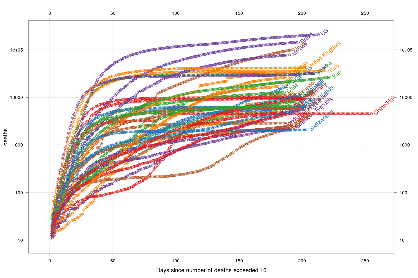
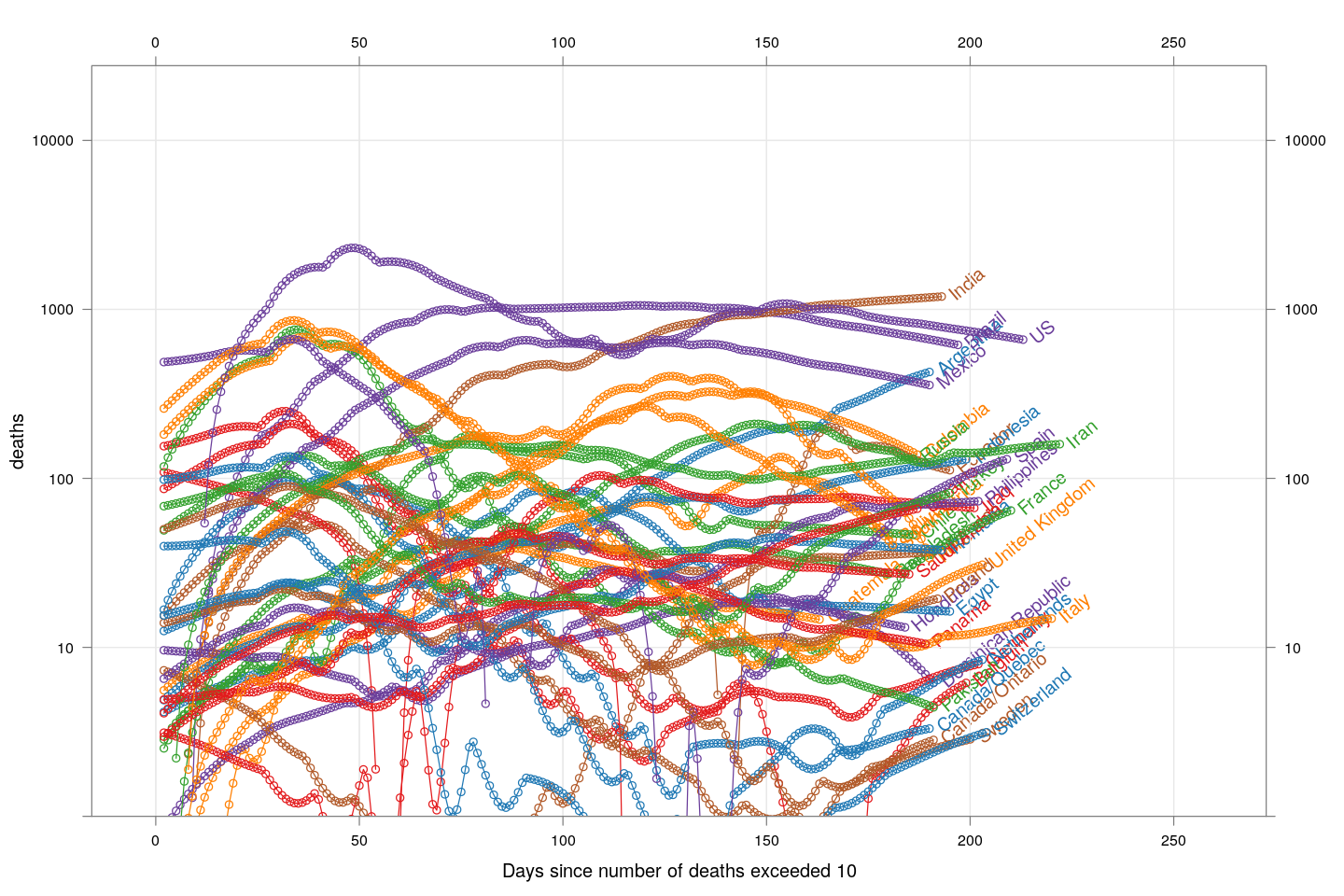
The number of deaths is a better measure of how serious the COVID-19 epidemic is in a country, compared to the number of detected cases, because deaths are less likely to be missed. The following plot, inspired by the very nice visualizations in the Financial Times, shows the growth in the number of deaths, starting from the day the count exceeded 10, for countries with at least 2000 deaths.
deathsSince10 <- function(region)
{
    x <- xcovid.deaths[, region, drop = TRUE]
    x <- x[x > 10]
    data.frame(region = region, day = seq_along(x),
               deaths = x, total = tail(x, 1))
}
deaths.10 <- do.call(rbind, lapply(colnames(xcovid.deaths), deathsSince10))
panel.glabel <- function(x, y, group.value, col.symbol, ...) # x,y vectors; group.value scalar
{
    n <- length(x)
    panel.text(x[n], y[n], label = group.value, pos = 4, col = col.symbol, srt = 40)
}
xyplot(deaths ~ day, data = subset(deaths.10, total >= 2000), grid = TRUE,
       scales = list(alternating = 3, y = list(log = 10, equispaced.log = FALSE)),
       xlab = "Days since number of deaths exceeded 10",
       groups = region, type = "o") +
    glayer_(panel.glabel(x, y, group.value = group.value, ...))
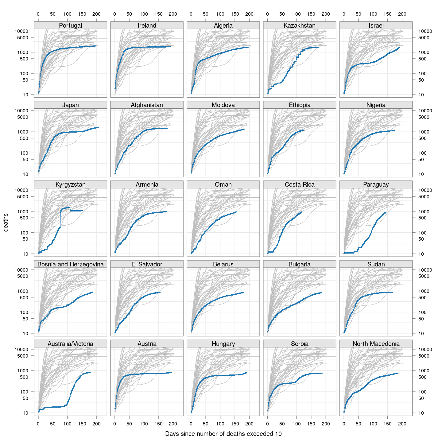
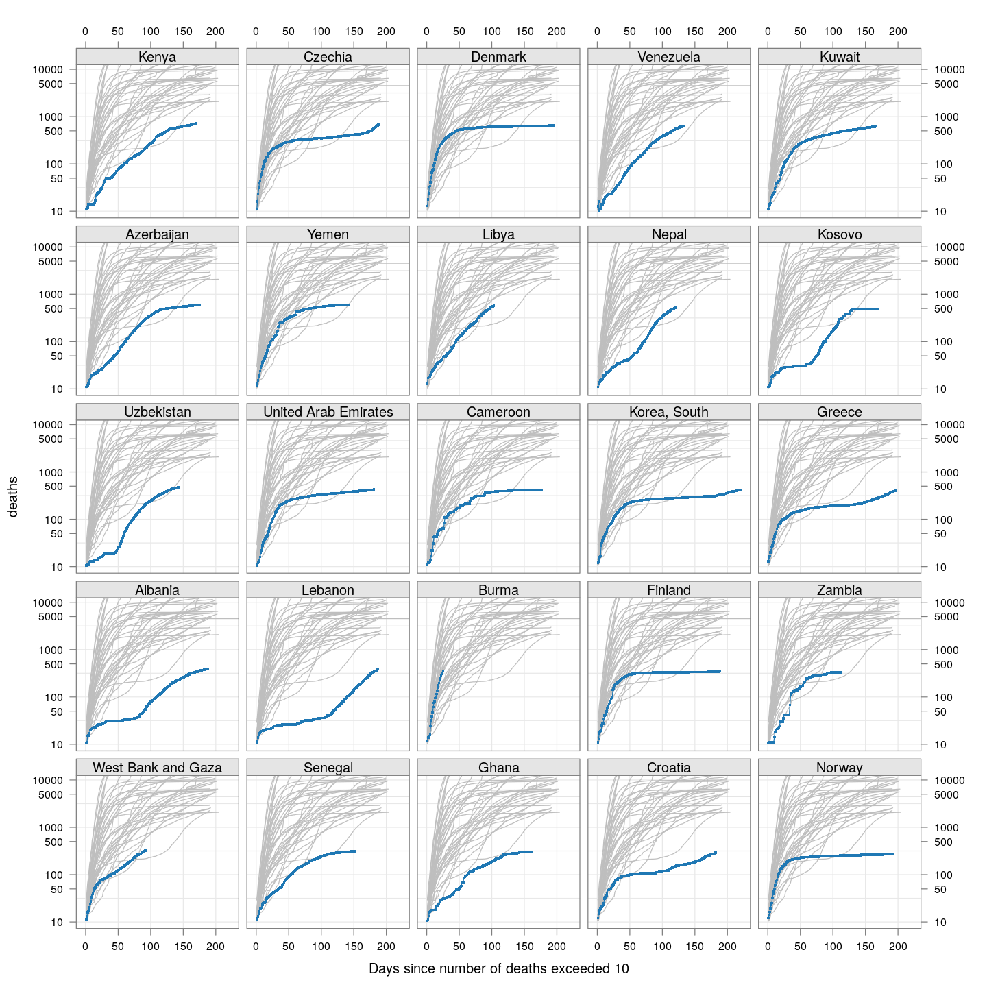
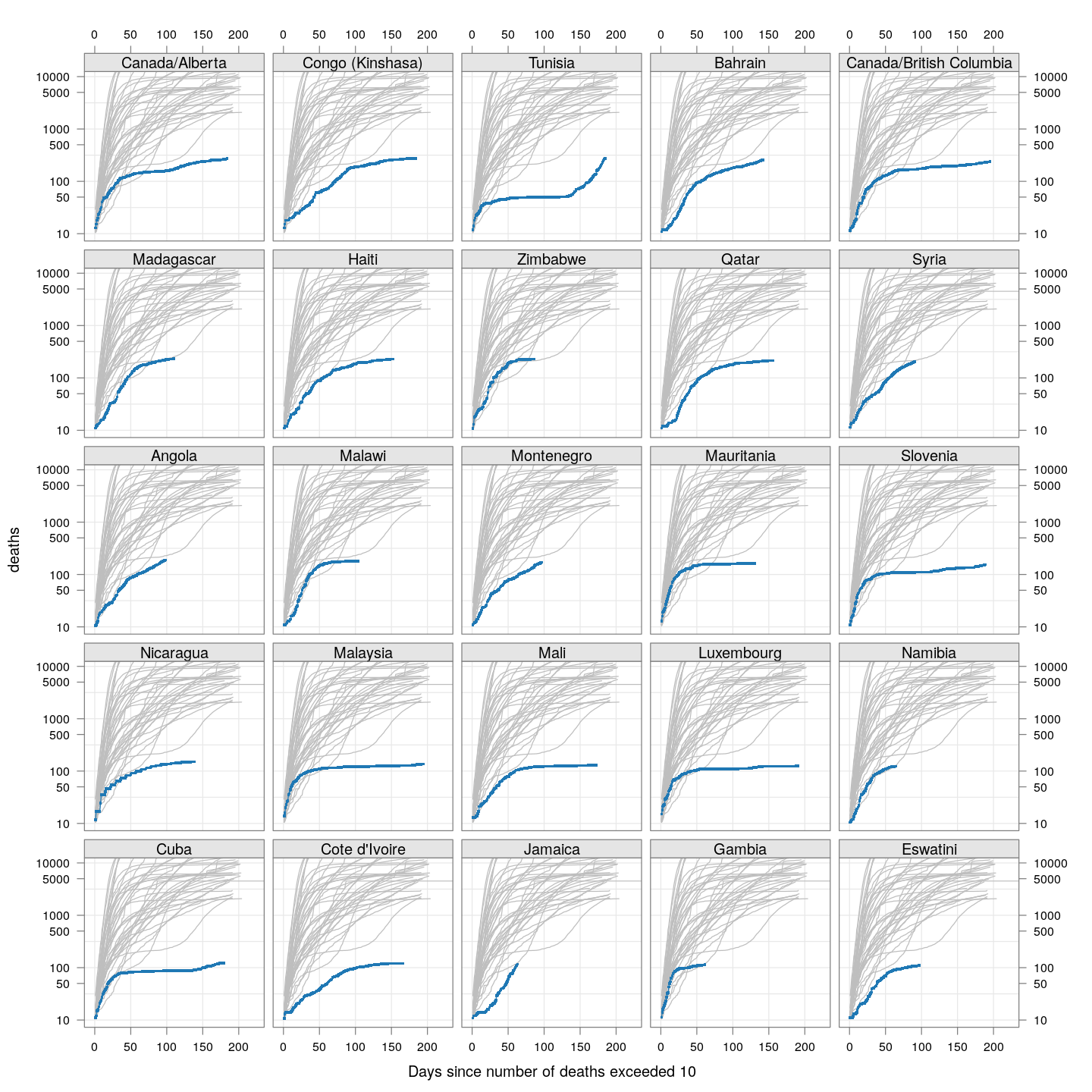
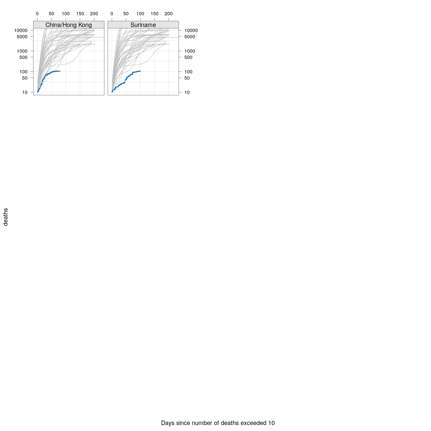
Compare these with other countries:
bg <- xyplot(deaths ~ day, data = subset(deaths.10, total >= 2000), grid = TRUE,
             scales = list(alternating = 3, y = list(log = 10, equispaced.log = FALSE)),
             col = "grey", groups = region, type = "l")
fg <-
    xyplot(deaths ~ day | reorder(region, -total), data = subset(deaths.10, total < 2000),
           xlab = "Days since number of deaths exceeded 10", pch = ".", cex = 3,
           scales = list(alternating = 3, y = list(log = 10, equispaced.log = FALSE)),
           as.table = TRUE, between = list(x = 0.5, y = 0.5), layout = c(5, 5),
           type = "o", ylim = c(NA, 12500))
fg + as.layer(bg, under = TRUE)
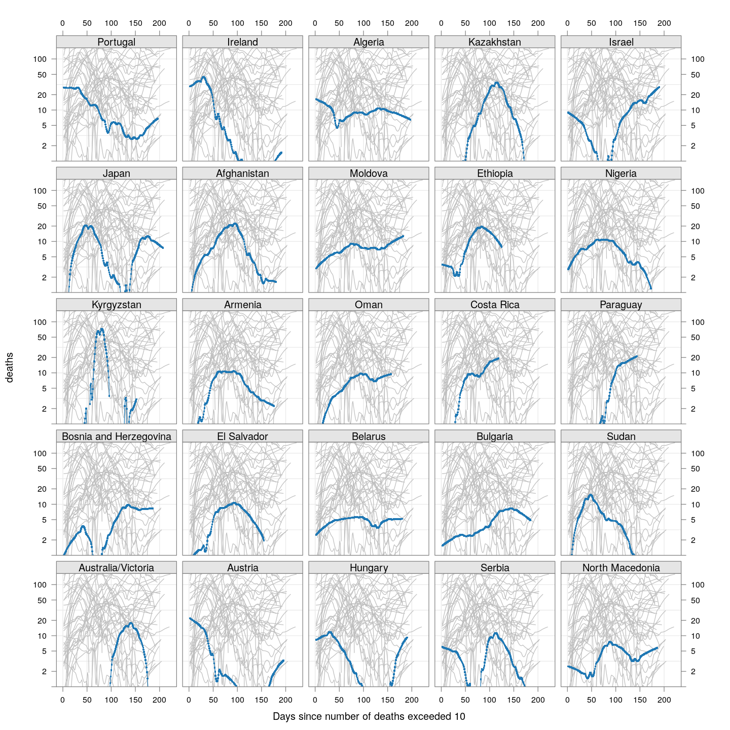
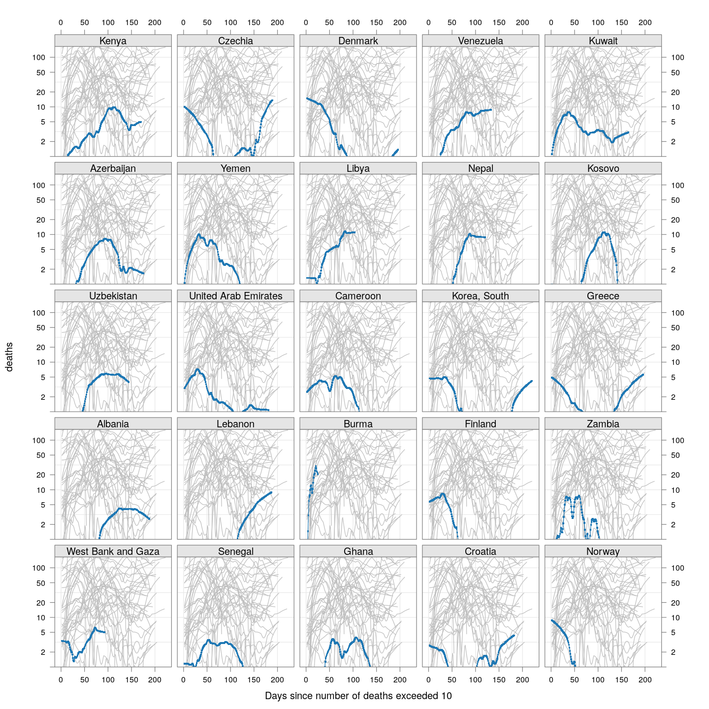
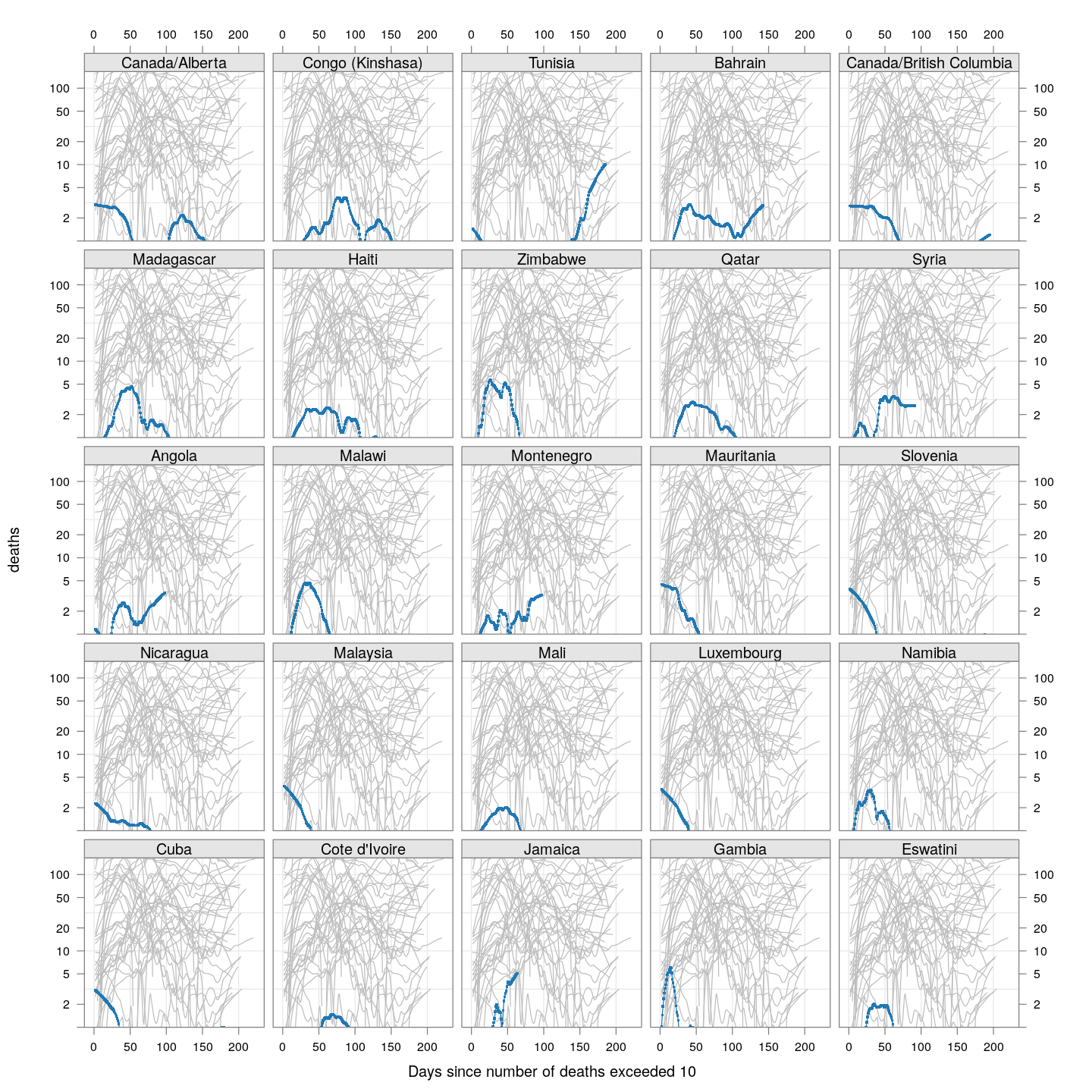
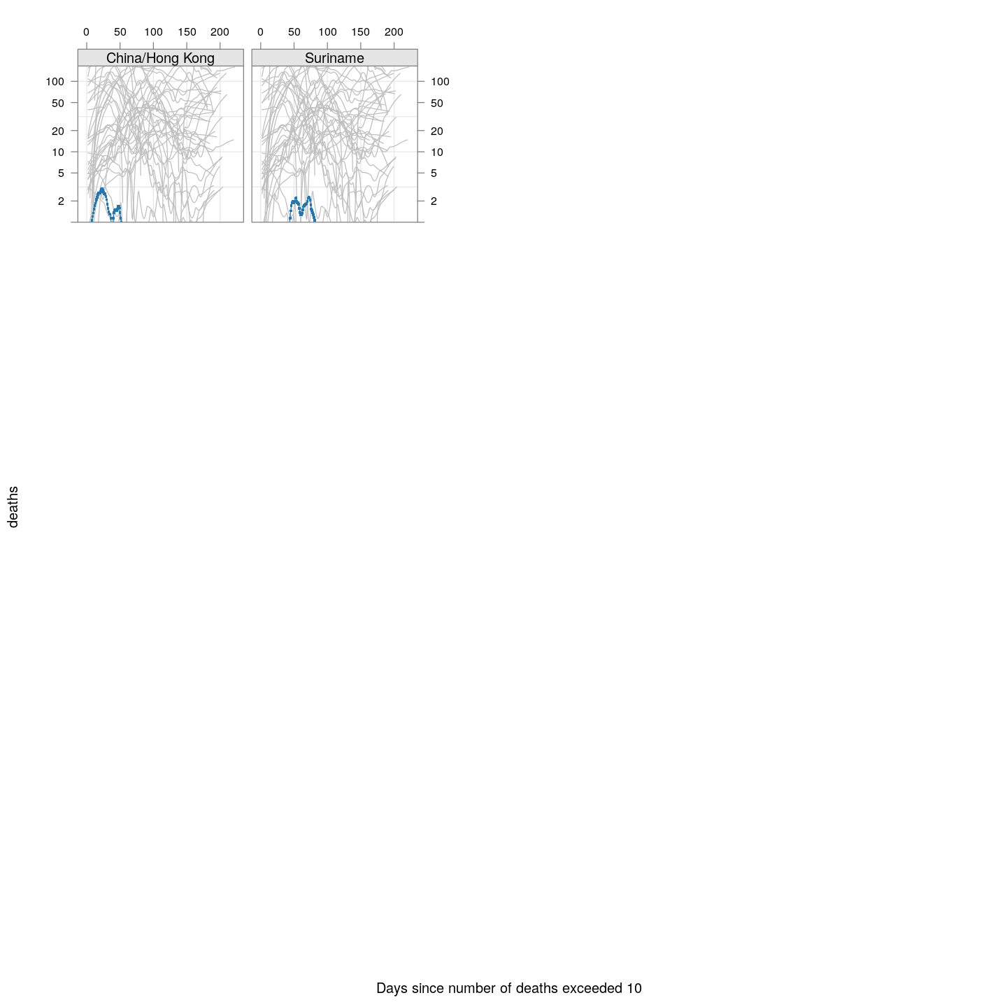
Which countries have reached their peak?
Another important landmark for any country is when it has passed its peak, that is, the daily number of new deaths (or cases) has started going down. The following plots show this trend, after applying a little bit of smoothing on the cumulative death counts.
newDeathsSince10 <- function(region)
{
    x <- xcovid.deaths[, region, drop = TRUE]
    x <- x[x > 10]
    days <- seq_along(x)
    xsmooth <- fitted(loess(x ~ days, span = 0.35))
    ## xsmooth <- sinh(predict(smooth.spline(days, asinh(x)), days)$y)
    data.frame(region = region, day = days[-1],
               deaths = diff(xsmooth), total = tail(x, 1))
}
new.deaths.10 <- do.call(rbind, lapply(colnames(xcovid.deaths), newDeathsSince10))
panel.glabel <- function(x, y, group.value, col.symbol, ...) # x,y vectors; group.value scalar
{
    n <- length(x)
    panel.text(x[n], y[n], label = group.value, pos = 4, col = col.symbol, srt = 40)
}
xyplot(deaths ~ day, data = subset(new.deaths.10, total >= 2000), grid = TRUE,
       scales = list(alternating = 3, y = list(log = 10, equispaced.log = FALSE)),
       xlab = "Days since number of deaths exceeded 10", ylim = c(1, NA),
       groups = region, type = "o") +
    glayer_(panel.glabel(x, y, group.value = group.value, ...))
There’s a lot of overlap, so let’s look at these countries separately:
bg <- xyplot(deaths ~ day, data = subset(new.deaths.10, total >= 2000), grid = TRUE,
             scales = list(alternating = 3, y = list(log = 10, equispaced.log = FALSE)),
             col = "grey", groups = region, type = "l", ylim = c(1, NA))
fg1 <-
    xyplot(deaths ~ day | reorder(region, -total), data = subset(new.deaths.10, total >= 2000),
           xlab = "Days since number of deaths exceeded 10", pch = ".", cex = 3, ylim = c(1, NA),
           scales = list(alternating = 3, y = list(log = 10, equispaced.log = FALSE)),
           as.table = TRUE, between = list(x = 0.5, y = 0.5),
           type = "o")
fg1 + as.layer(bg, under = TRUE)
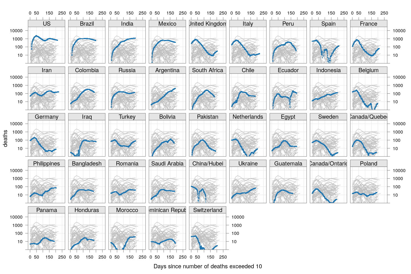
As of May 12, most of these countries appear to have passed their peaks, except Mexico and Brazil.
Compare these with other countries (But beware of potential artifacts of the smoothing):
fg2 <-
    xyplot(deaths ~ day | reorder(region, -total),
           data = subset(new.deaths.10, total < 2000),
           xlab = "Days since number of deaths exceeded 10",
           pch = ".", cex = 3, ylim = c(1, NA),
           scales = list(alternating = 3, y = list(log = 10, equispaced.log = FALSE)),
           as.table = TRUE, between = list(x = 0.5, y = 0.5), layout = c(5, 5),
           type = "o")
fg2 + as.layer(bg, under = TRUE)
-
As before, we apply a crude “smoothing” to account for lags in updating data: If two consecutive days have the same total count followed by a large increase on the following day, then the most likely explanation is that data was not updated on the second day. In such cases, the count of the middle day is replaced by the geometric mean of its neighbours. ↩