Doubling times of COVID-19 cases
[NOTE: The commentary in this document is now severely outdated, even though I still try to update the results once every few days.]
Is “social distancing” working in your country? How is it doing compared to other countries? How long will it take for the number of cases to reach 50,000? Or 100,000? Or a million?
This is an attempt to summarize, on an ongong basis, how successfully various countries / regions are containing the spread COVID-19, based on a very simple summary statistic: how long it is taking to double the number of cases, and how this “doubling time” changes over time.
The analysis is based on the official number of confirmed cases, based on data provided by JHU CSSE on Github. Not all countries are testing equally aggressively, for various reasons. For example, India is testing (as on March 20) only symptomatic individuals who are international travelers, contacts of positive cases, health care workers, and unlinked symptomatic patients serious enough to be hospitalized. So, these numbers may not reflect the actual number of cases. In the long run though, that does not matter as long as the proportion of true cases being detected remains more or less stable (even this proportion may change as the testing poicy is refined).
Here is the source of this analysis, in case you want to experiment with it. The analysis is done using R, click here to show / hide the R code.
Executive summary
In most countries, the number of cases are doubling every 3 to 5 days. This means that if you have, say, 1000 cases today, you will have 50,000 cases in around 3 weeks from today, and a million cases in one and a half months. Unless the doubling time increases soon.
For more substantive data-driven analysis, see here and here.
Preparatory steps
First, we download the data and read it in.
TARGET <- "time_series_covid19_confirmed_global.csv"
## To download the latest version, delete the file and run again
if (!file.exists(TARGET))
    download.file("https://github.com/CSSEGISandData/COVID-19/raw/master/csse_covid_19_data/csse_covid_19_time_series/time_series_covid19_confirmed_global.csv",
                  destfile = TARGET)
covid <- read.csv(TARGET, check.names = FALSE,
                  stringsAsFactors = FALSE)
covid <- subset(covid, ((`Country/Region` != "Diamond Princess") &
                        !(`Province/State` %in% c("Diamond Princess", "Grand Princess"))))
This version was last updated using data downloaded on 2020-10-03.
Many of the high numbers are provinces in China, where spread is now more or less controlled. We consider them separately. Data for the USA, available separately by state, is considered separately as well. We exclude cases on cruise ships, which represent small populations.
covid.china <- subset(covid, `Country/Region` == "China")
covid.row <- subset(covid, `Country/Region` != "China")
Next, we extract the time series data of each subset as a data matrix, with a crude “smoothing” to account for lags in updating data: If two consecutive days have the same total count followed by a large increase on the following day, then the most likely explanation is that data was not updated on the second day. In such cases, the count of the middle day is replaced by the geometric mean of its neighbours.
extractCasesTS <- function(d)
{
    x <- t(data.matrix(d[, -c(1:4)]))
    x[x == -1] <- NA
    colnames(x) <-
        with(d, ifelse(`Province/State` == "", `Country/Region`,
                       paste(`Country/Region`, `Province/State`,
                             sep = "/")))
    ## Update labels to include current total cases
    colnames(x) <-  sprintf("%s (%g)", colnames(x), x[nrow(x), ])
    apply(x, 2, correctLag)
}
xcovid.china <- extractCasesTS(covid.china)
xcovid.row <- extractCasesTS(covid.row)
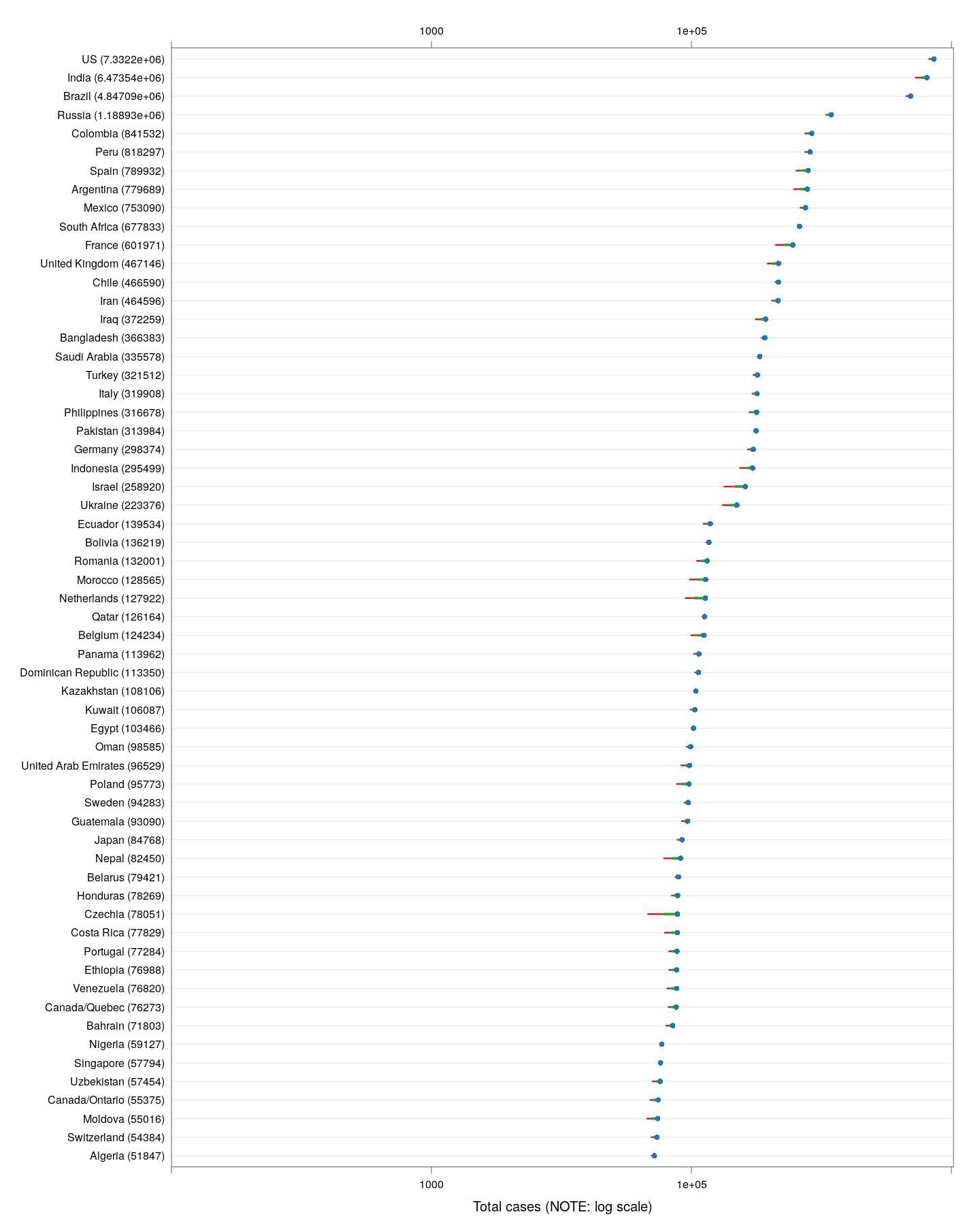
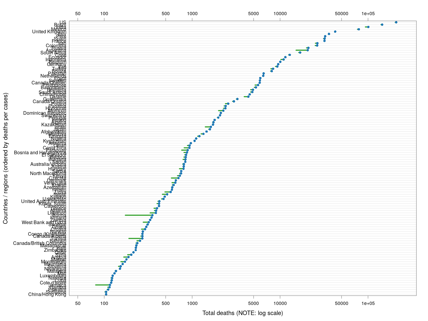
Outside China, which countries are the worst affected in terms of the latest absolute numbers so far? The following plot shows the latest counts, and also shows how much the counts have increased in the last week, and the week before that. These are on a logarithmic scale, which means that the one-week increases are a measure of the percentage increase; larger means faster rate of growth.
total.row <- apply(xcovid.row, 2, tail, 1)
total.row.1weekago <- apply(xcovid.row, 2, function(x) tail(x, 8)[1])
total.row.2weekago <- apply(xcovid.row, 2, function(x) tail(x, 15)[1])
torder <- tail(order(total.row), 60)
dotplot(total.row[torder],
        total.1 = total.row.1weekago[torder],
        total.2 = total.row.2weekago[torder],
        xlab = "Total cases (NOTE: log scale)",
        xlim = c(10, NA),
        panel = function(x, y, ..., total.1, total.2, col) {
            col <- trellis.par.get("superpose.line")$col
            dot.line <- trellis.par.get("dot.line")
            panel.abline(h = unique(y), col = dot.line$col, lwd = dot.line$lwd)
            panel.segments(log10(total.2), y, log10(total.1), y, col = col[3], lwd = 2)
            panel.segments(log10(total.1), y, x, y, col = col[2], lwd = 3)
            panel.points(x, y, pch = 16, col = col[1])
        },
        scales = list(x = list(alternating = 3, log = 10, equispaced.log = FALSE)))
The latest numbers don’t tell the whole story however, even combined with the one-week increase. Different countries are at different stages of the pandemic, and just because the numbers are low now does not mean they will remain low. We should be more concerned about what is going to happen, and that depends on what measures various countries / regions are taking. How can we compare countries at various stages of spread in terms of something that is actually comparable?
The doubling time
It is not unreasonable to assume that without any preventive measures, the number of infections will grow exponentially in the early phases, when most of the population is uninfected. So estimating a growth rate assuming exponential growth may sound reasonable. Fortunately, most countries are taking preventive steps, so this estimate needs to be updated with time. We look at a very simple measure: at any given time, how many days ago was the number of cases half of the current count? We call this the doubling time.
This doubling time is a crude estimate of the current rate of spread of the virus. It is comparable across time as well as countries at different stages of spread, and additionally, it is not affected by the proportion of true cases that are being identified, as long as this proportion does not change substantially. For uncontrolled exponential growth, we expect the doubling time to remain constant. If measures are being effective, we should see the doubling time increasing.
To estimate the doubling times, we use the R function approxfun() to
do linear interpolation with day as function of number, and then use
it to evaluate the “day” at which the number was half of the current
count. To see how the doubling time has evolved over time, we compute
the doubling time using data upto a given timepoint, but only starting
from days when the total count has exceeded 50, so that the estimates
are not meaningless.
The situation in China
Let’s do this first for the provinces of China that had at least 200 cases, and plot the evolution of doubling time over time. Instead of ordering the provinces by total number of cases, we order them by the number of days since the total count first exceeded 50. The dotted line at January 23 indicates the date of the initial lockdown of Wuhan, with more lockdowns following very soon. Although initially it was taking less that five days for the number of cases to double, the doubling time has systematically increased after the lockdown (possibly with a lag of around 10 days).
regions <- # at least 200 cases
    names(which(apply(xcovid.china, 2, tail, 1) > 199))
devolution <-
    droplevels(na.omit(do.call(rbind,
                               lapply(regions, doubling.ts,
                                      d = xcovid.china, min = 50))))
xyplot(tdouble ~ date | reorder(region, tdouble, function(x) -length(x)),
       data = devolution, type = "o", pch = '.', cex = 3, grid = TRUE,
       xlab = "Date", ylab = "Doubling time (days)",
       scales = list(alternating = 3, x = list(rot = 45)),
       as.table = TRUE, between = list(x = 0.5, y = 0.5),
       abline = list(v = as.Date("2020-01-23"),
                     col = "grey50", lwd = 2, lty = 3))
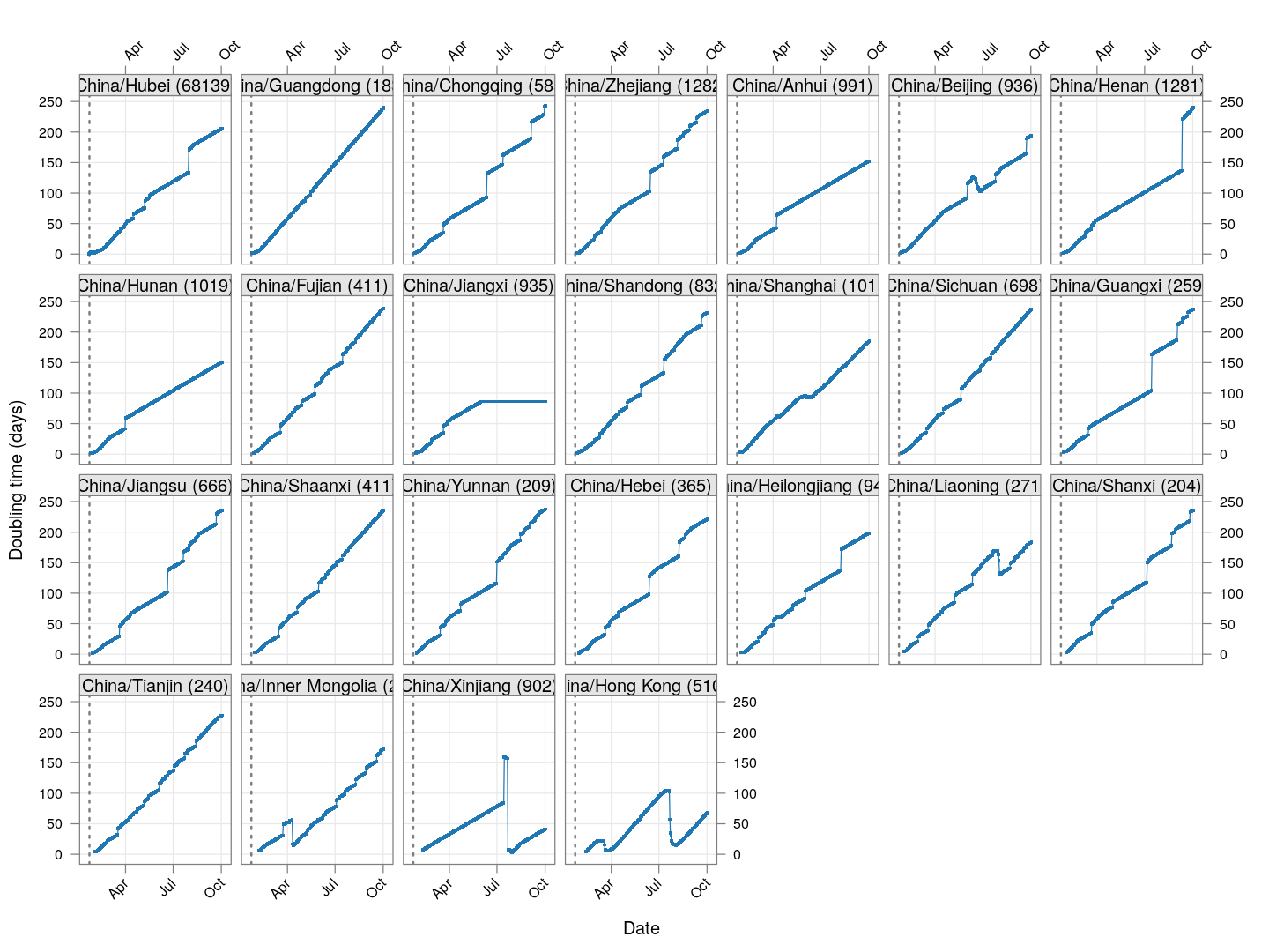
As of March 22, the doubling time in Hong Kong had stabilized (at around 20 days) for roughly two weeks before decreasing rapidly; this is likely due to already infected travelers returning, and is also happening in Singapore and Taiwan.
The situation elsewhere
Countries with already widespread infections
Next, let’s look at similar plots for other countries where the count is at least 1000. Again, the countries / regions are sorted by how long ago the number of cases first exceeded 50, and not by total cases.
regions <-  # at least 1000 cases
    names(which(apply(xcovid.row, 2, tail, 1) > 999))
devolution <-
    droplevels(na.omit(do.call(rbind, lapply(regions, doubling.ts,
                                             d = xcovid.row, min = 50))))
xyplot(tdouble ~ date | reorder(region, tdouble, function(x) -length(x)),
       data = devolution, type = "o", pch = ".", cex = 3, grid = TRUE,
       ylim = c(0, 40), xlab = "Date", ylab = "Doubling time (days)",
       scales = list(alternating = 3, x = list(rot = 45)),
       layout = c(4, 4), as.table = TRUE, between = list(x = 0.5, y = 0.5))
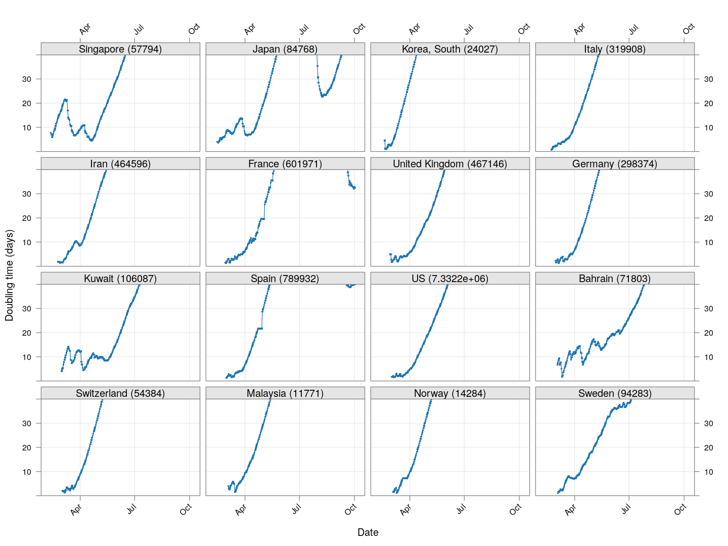
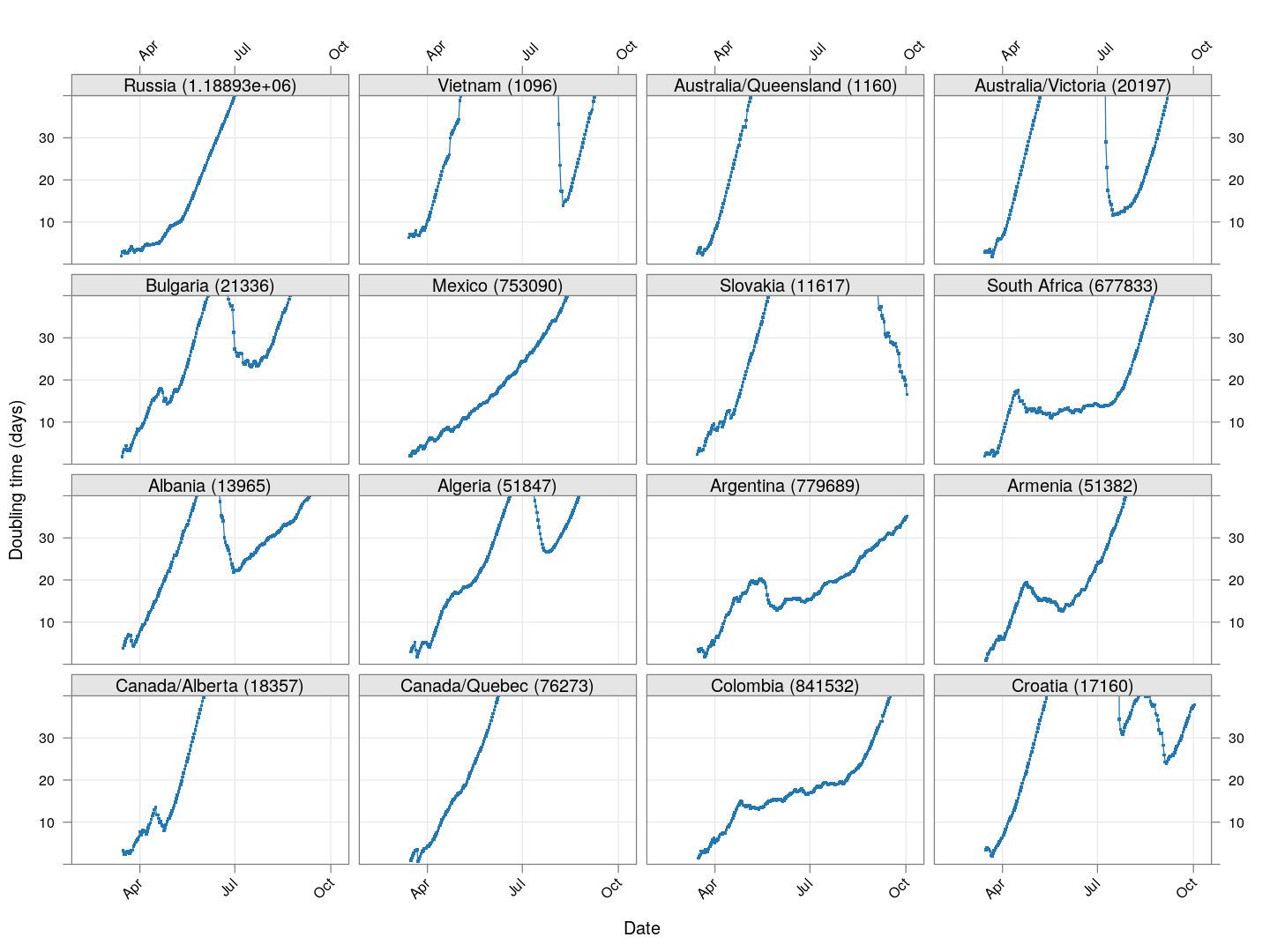
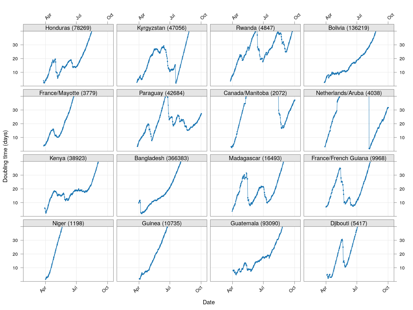
Many of these countries were not showing systematic increase in the doubling time till recently. With uncontrolled exponential growth at the then current rates as on March 21, for example,
-
Germany was on its way to reach 50,000 cases by March 25
-
Spain would have reached 50,000 cases by March 27
-
France would have reached 50,000 cases by March 31
Germany has shown steady improvement since then (it actually reached 50,000 cases on March 27). Spain did not improve immediately, and reached 50,000 cases on March 26, but has been improving steadily since then. France, which reached 50,000 cases on March 31, is showing some improvement, but not a lot yet.
The UK, which has 9529 cases as on March 26, is showing some recent improvement, but is still on track to reach 50,000 cases between April 4 and April 10.
The countries that seem to be doing well are Denmark, Sweden, and Norway, and to a lesser extent Iran and even Italy.
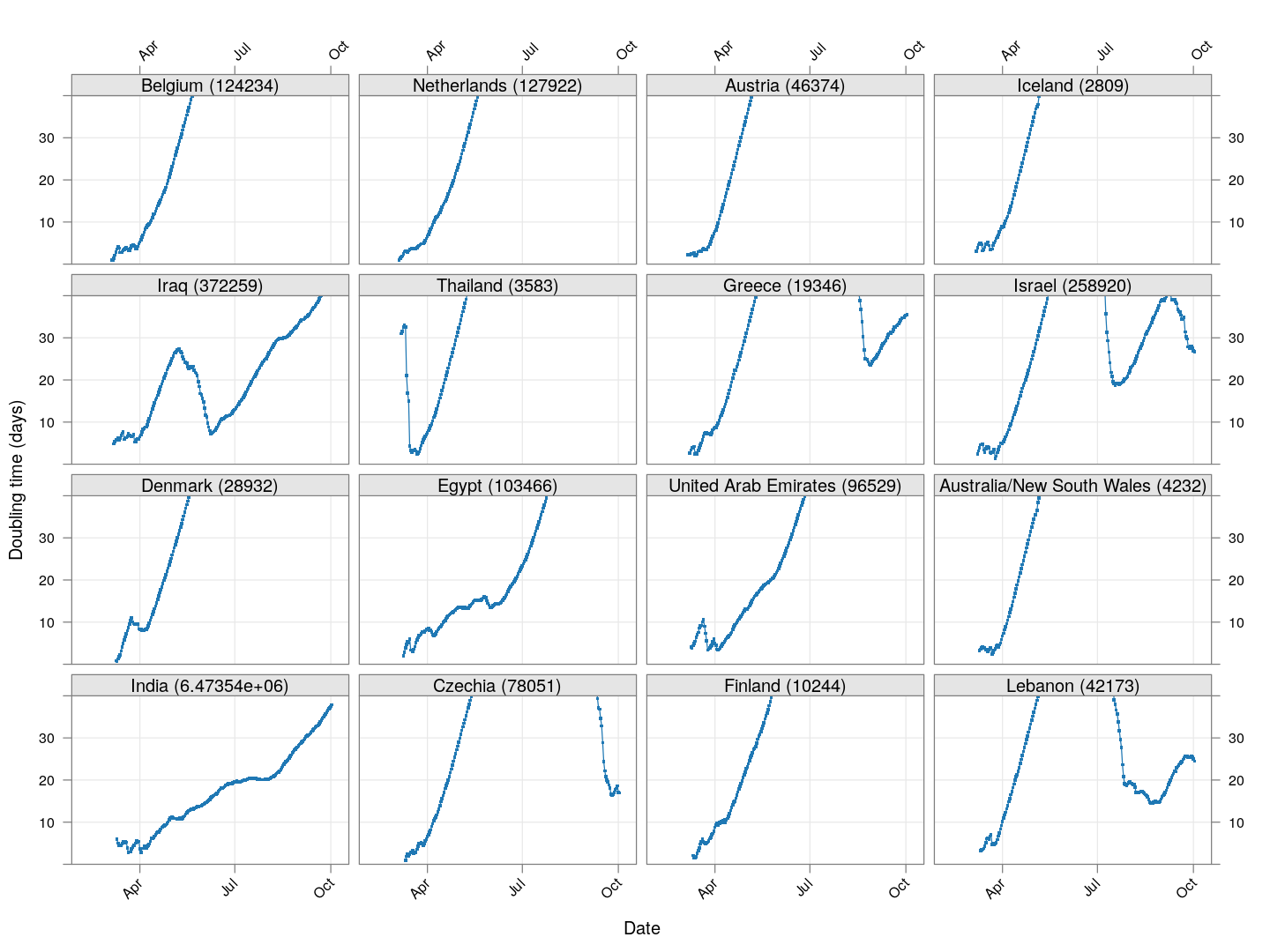
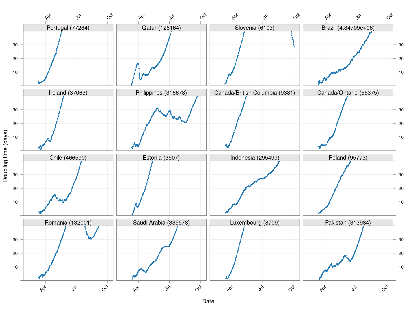
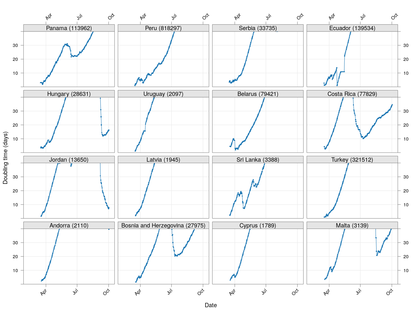
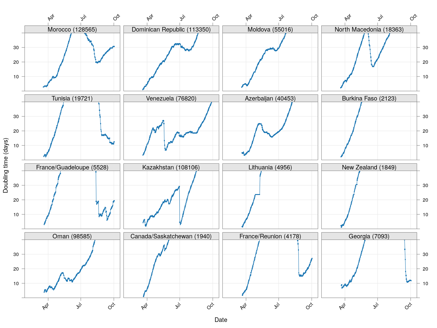
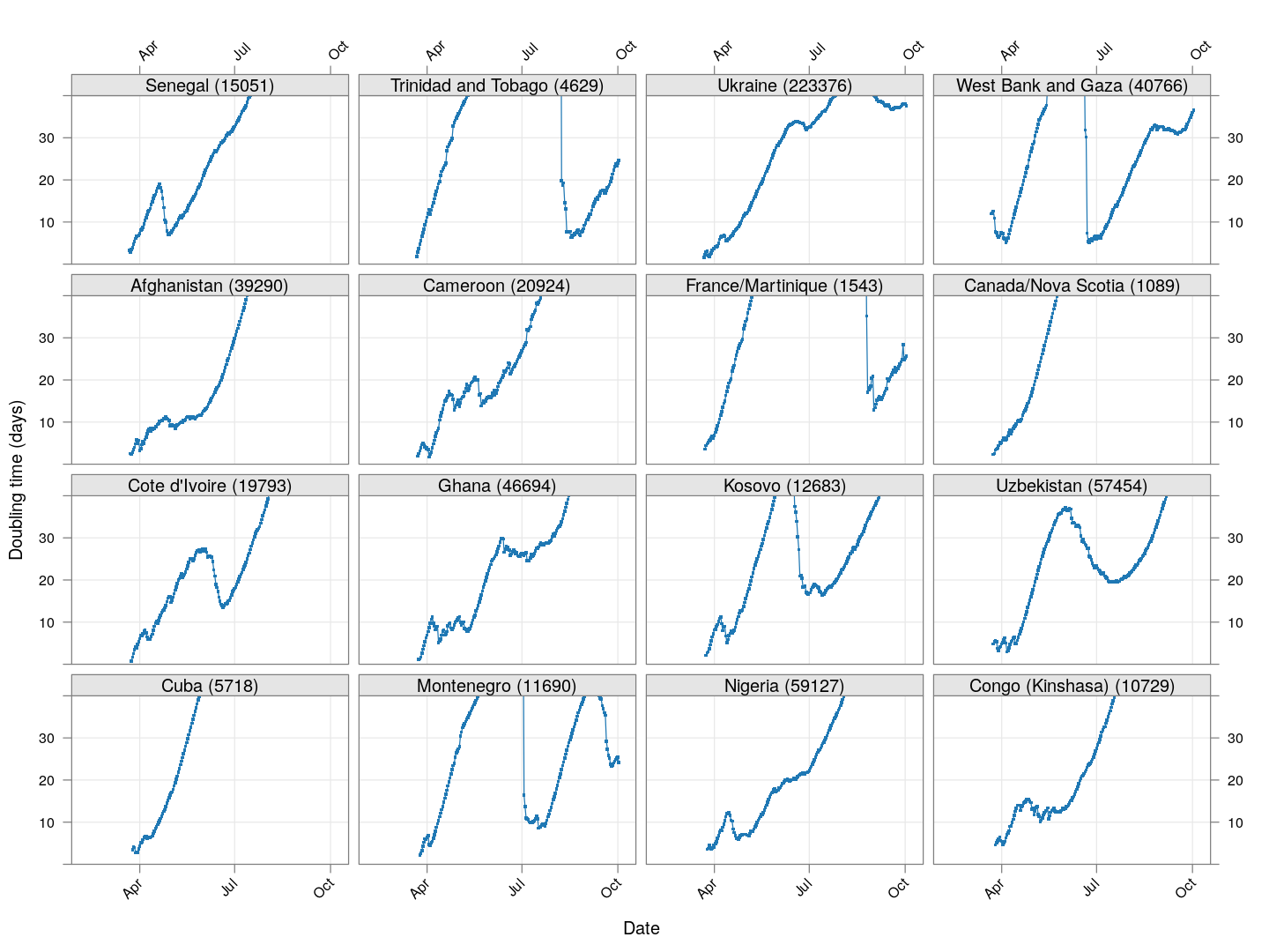
Countries with less widespread infections
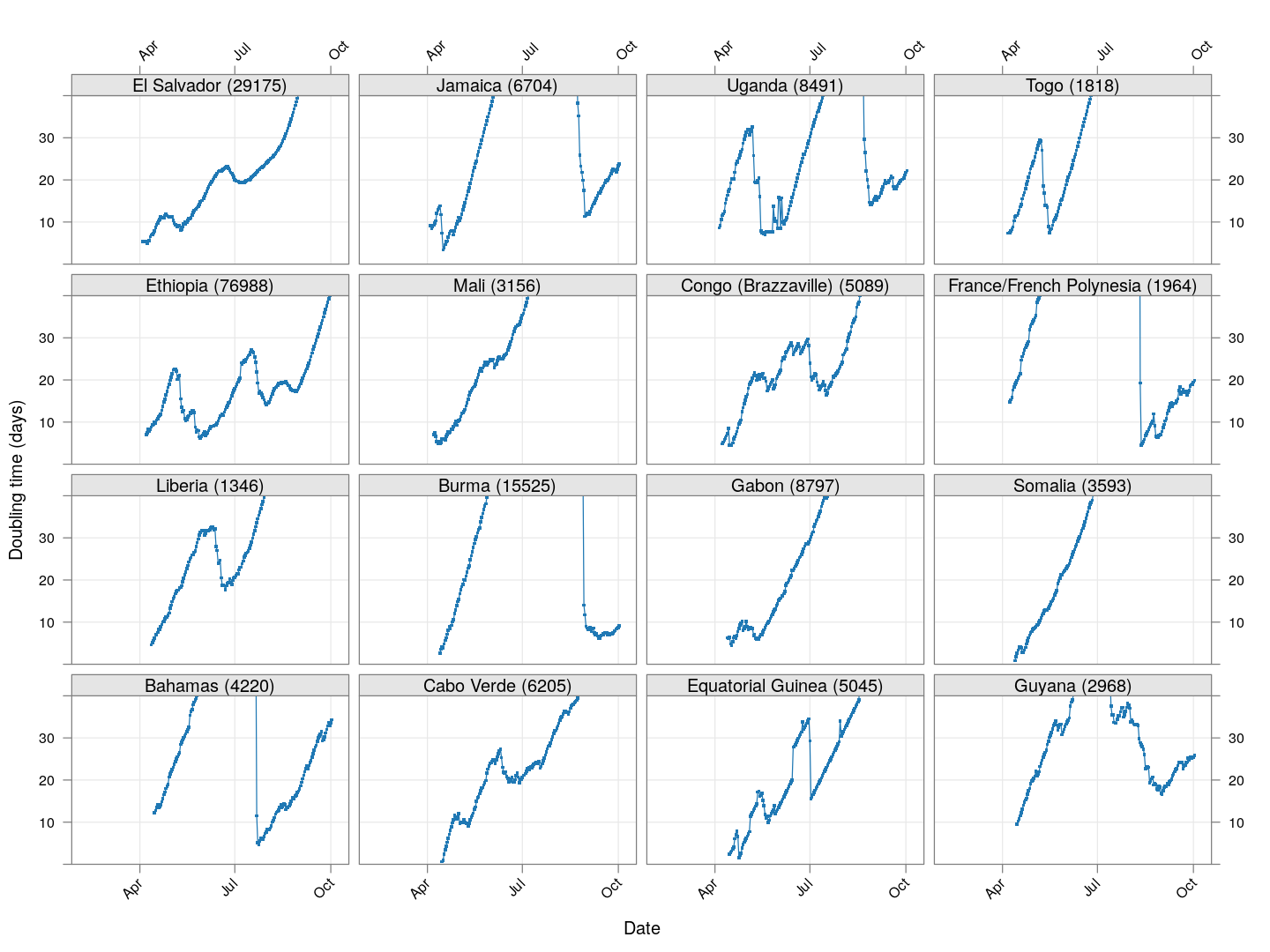
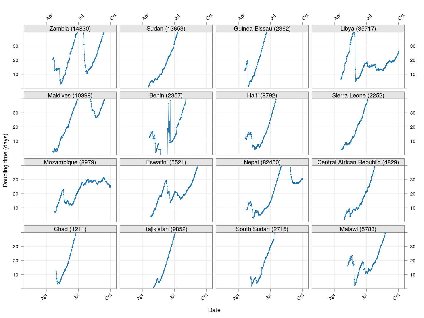
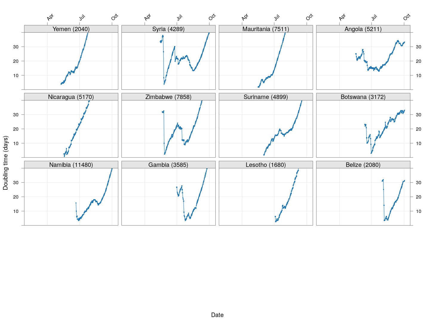
Next, we look at countries where the count is at least 200 but less than 1000.
total.row <- apply(xcovid.row, 2, tail, 1)
regions <-  # between 100 and 1000 cases
    names(which(total.row > 199 & total.row < 1000))
devolution <-
    droplevels(na.omit(do.call(rbind, lapply(regions, doubling.ts,
                                             d = xcovid.row, min = 50))))
xyplot(tdouble ~ date | reorder(region, tdouble, function(x) -length(x)),
       data = devolution, type = "o", pch = ".", cex = 3, grid = TRUE,
       ylim = c(0, 40), xlab = "Date", ylab = "Doubling time (days)",
       scales = list(alternating = 3, x = list(rot = 45)),
       layout = c(4, 4), as.table = TRUE, between = list(x = 0.5, y = 0.5))
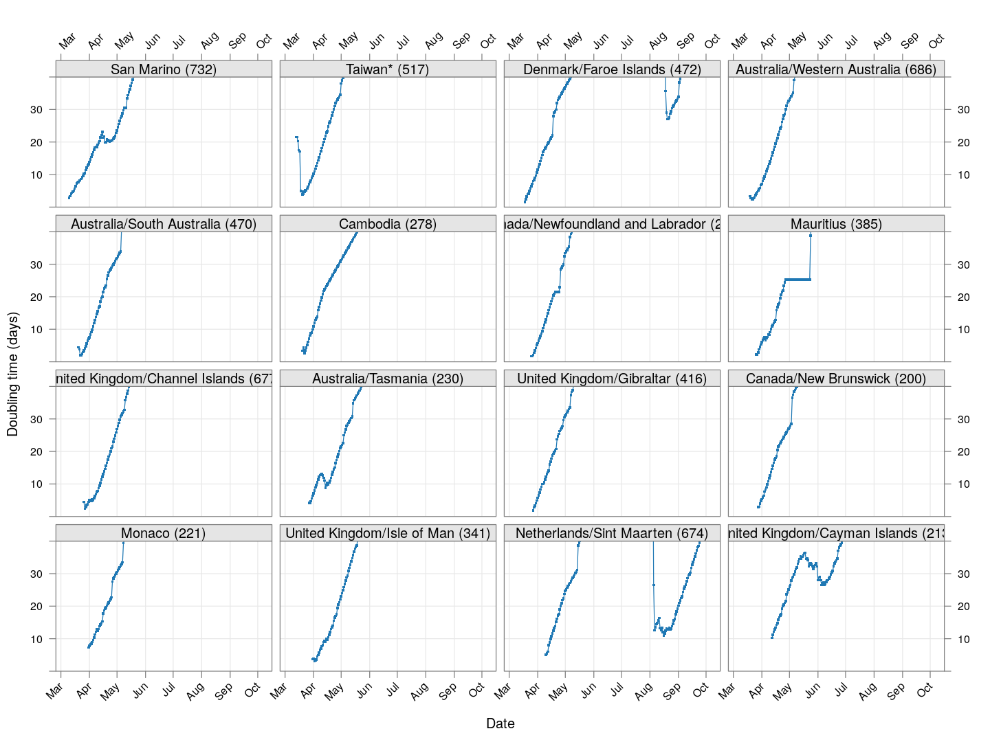
It is too early to say how things will go for these countries, as the effect of social distancing measures will not be reflected before a couple of weeks.
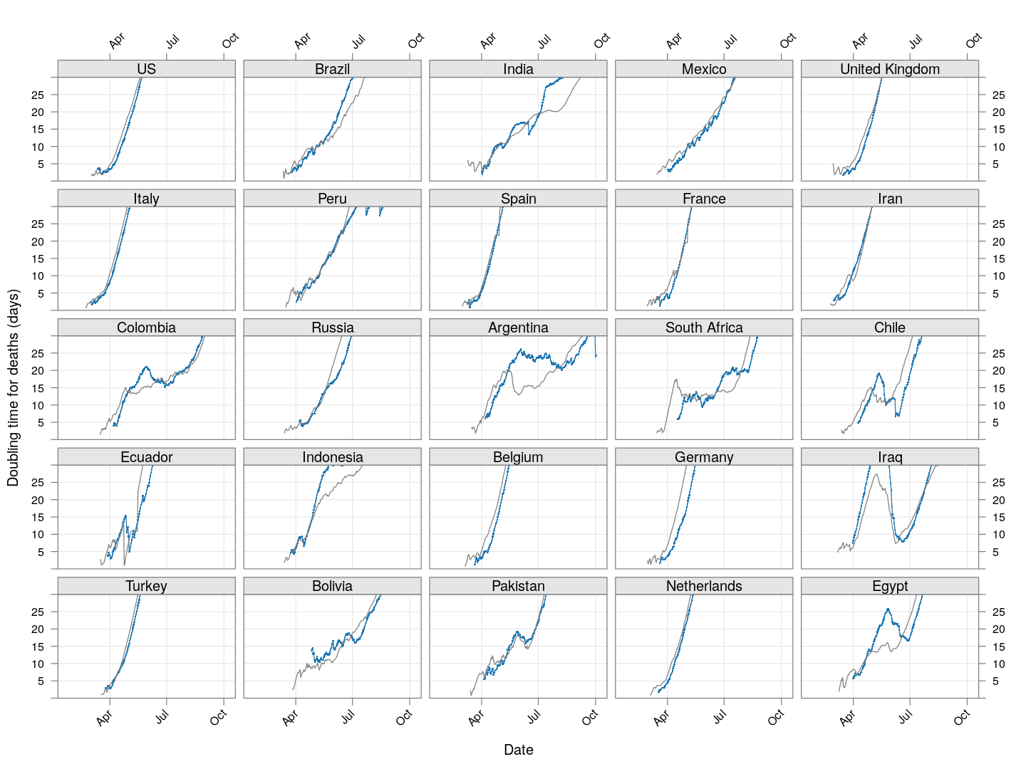
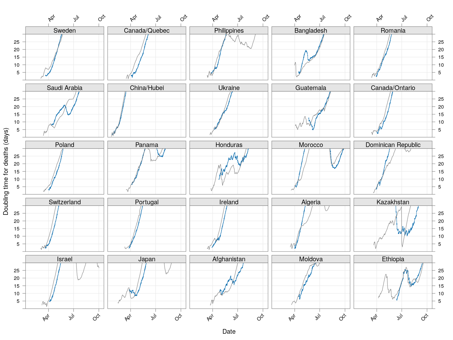
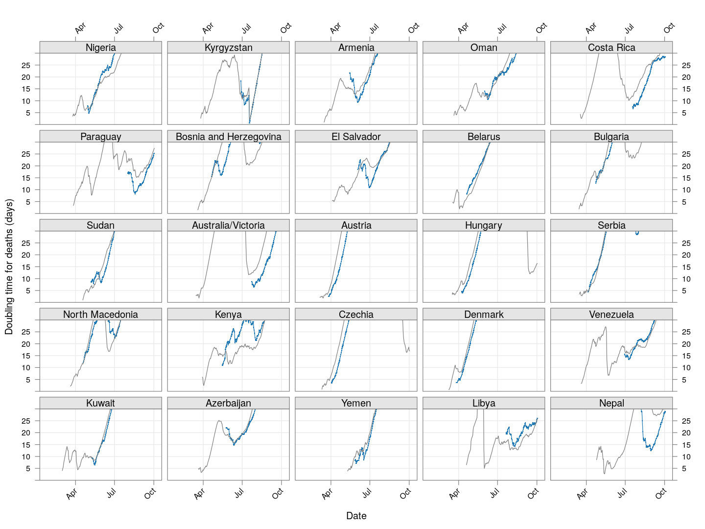
The doubling time of death rates
A similar analysis can be done for death rates (code here). We only consider countries / regions with at least 100 deaths. The following plot shows the current number of deaths and compares it with the number one week ago (on a log scale).
The following plot gives the doubling time for deaths in these countries, along with the corresponding doubling times for total cases in grey. Generally speaking, the doubling times are comparable within each country / region (possibly with a slight lag).