Statistical Implications of Pooled testing
[Here is the source of this document. Click here to show / hide the R code used. ]
Background
To estimate the prevalence of the COVID-19 virus in a given population, a simple strategy would be to take a random sample and test everyone. Usually the cost of sampling is proportional to the number of individuals in the sample. However, in the current scenario, there are two different cost aspects: sample collection and the actual testing. Given the limited availability of test kits / reagents, a possible strategy is to combine several individual samples (swabs) and test them together.
The following analysis assumes a very simple setup: that the cost of collecting samples (swabs) is negligible, but the cost of testing is not. In practice, the considerations will be more complex, but the same ideas should go through.
Estimation
Assuming that samples (swabs) are randomly mixed before being tested, the estimation calculations are fairly simple. Suppose that
-
$m$ is the total number of tests that are to be performed (depends on available resources).
-
$k$ is the number of samples (swabs) combined in each test.
-
$n = mk$ is thus the total number of individuals sampled.
Here the idea is that $m$ is fixed by resource constraints, but $k$ (hence $n$) can be chosen to be anything. The goal is to choose $k$ using some statistical optimality criterion.
Suppose the true proportion of positive cases in the population is $p$. Then the probability that each test sample (combining $k$ randomly sampled individuals) is “positive” is \begin{equation} q = 1 - (1-p)^k \implies p = 1 - (1-q)^{(1/k)} \end{equation} Assuming that the test is perfect (no false positives or false negatives), the total number $T$ of positive tests has a Binomial distribution:
\[T \sim Bin(m, q)\]The obvious point estimates then are
-
$\hat{q} = T / m$
-
$\hat{p} = 1 - (1-\hat{q})^{(1/k)}$
$\hat{q}$ is unbiased for $q$ and has a variance of $q(1-q)/n$. Using the Delta Method, it follows that $\hat{p}$ is also asymptotically unbiased (for large $m$) with a variance of
\[\frac{1 - (1-p)^k}{mk^2} (1-p)^{(2-k)}\]Simulation
Ideally, we want to choose $k$ such that $\hat{p}$ is closest to the true $p$. This will of course depend on $p$. The following simulations fix the values of $m$ and $p$, and explores the effect of varying $k$.
$m=1000, p=0.01$
The following plot shows simulated $\hat{p}$ values for $k$ runnning from 1 to 70, with 500 replcations for each $k$.
M <- 1000
P <- 0.01
g <- expand.grid(m = M, k = 1:70, p = P, rep = 1:500)
g <- within(g,
            {
                t <- rbinom(nrow(g), size = m, prob = 1 - (1-p)^k)
                qhat <- t / m
                phat <- 1 - (1-qhat)^(1/k)
            })
xyplot(phat ~ k, data = g, jitter.x = TRUE, grid = TRUE, alpha = 0.2,
       abline = list(h = P), ylab = expression(hat(p)))
Clearly, increasing $k$ improves the precision of $\hat{p}$, although the marginal benefit of increasing $k$ is negligible after a while.
The following plot shows the (simulation) mean squared error (in estimating $p$) for each $k$, and compares with the explicitly computed variance given above (the black line).
xyplot(tapply((phat - p)^2, k, mean) ~ tapply(k, k, unique),
       data = g, grid = TRUE, type = "o", pch = 16,
       xlab = "k",
       ylab = expression("Mean Square Error of " * hat(p))) +
    layer_(panel.curve((1 - (1-P)^x) * (1-P)^(2-x) / (M*x^2), from = 1))
This confirms our visual impression that increasing $k$ is useful, and that the explicit caculation matches what we see in simulation.
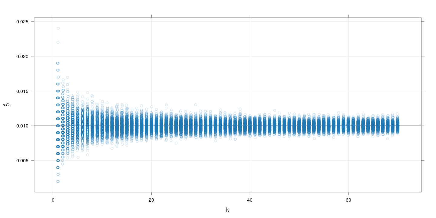
$m=1000, p=0.1$
The following plot again shows simulated $\hat{p}$ values for $k$ runnning from 1 to 70, with 500 replcations for each $k$. This time, $p$ is substantially higher at $0.1$.
M <- 1000
P <- 0.1
g <- expand.grid(m = M, k = 1:70, p = P, rep = 1:500)
g <- within(g,
            {
                t <- rbinom(nrow(g), size = m, prob = 1 - (1-p)^k)
                qhat <- t / m
                phat <- 1 - (1-qhat)^(1/k)
            })
xyplot(phat ~ k, data = g, jitter.x = TRUE, grid = TRUE, alpha = 0.2,
       abline = list(h = P), ylab = expression(hat(p)))
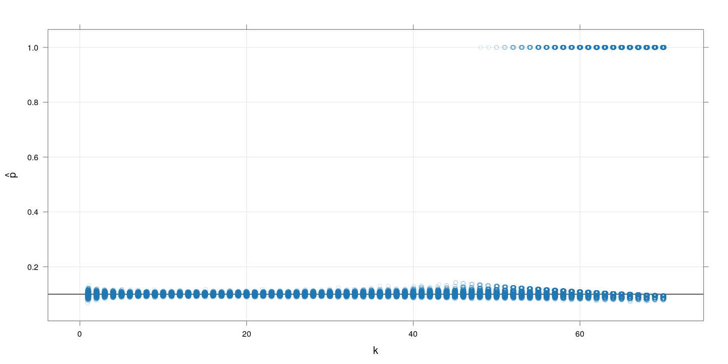
The problem here is that when combining too many samples, the per-test positive probability becomes too high, and often all the $m$ tests turn positive. For example, with $k=50$ and $p=0.1$, the value of $q$ is 0.9948.
Restricting to $k \leq 40$ and omitting the cases where $\hat{p} = 1$, we get:
xyplot(phat ~ k, data = g, jitter.x = TRUE, grid = TRUE, alpha = 0.2,
       subset = (k <= 40) & (phat < 1),
       abline = list(h = P), ylab = expression(hat(p)))
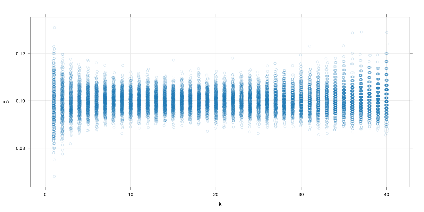
Here, increasing $k$ improves the precision of $\hat{p}$ up to a point, after which it decreases again.
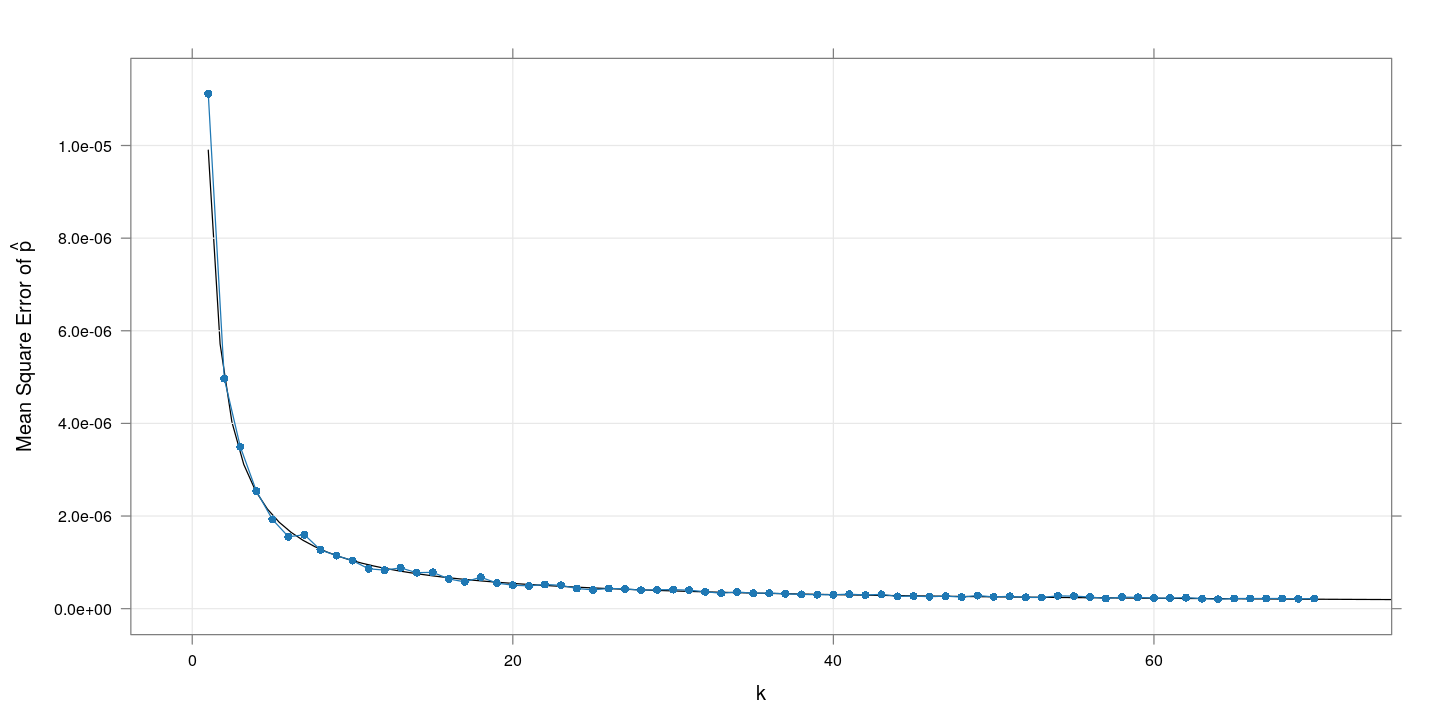
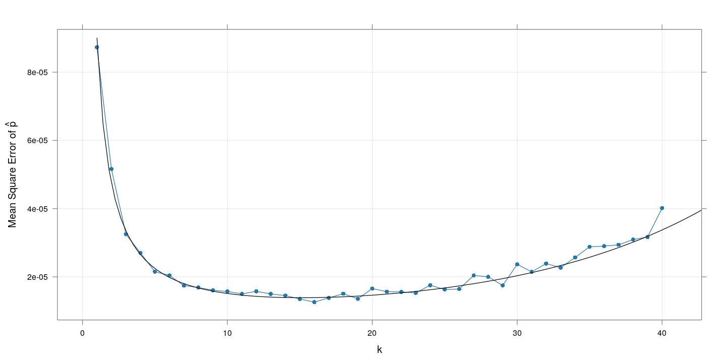
The plot of the corresponding (empirical and theoretical) mean squared error suggests an optimal range of $k$ between 10 and 20.
xyplot(tapply((phat - p)^2, k, mean) ~ tapply(k, k, unique),
       data = g, grid = TRUE, type = "o", pch = 16,
       subset = (k <= 40) & (phat < 1),
       xlab = "k",
       ylab = expression("Mean Square Error of " * hat(p))) +
    layer(panel.curve((1 - (1-P)^x) * (1-P)^(2-x) / (M*x^2), from = 1))
The following plot shows how the theoretical precision (mean square error) changes with $k$ for a few additional values of $p$:
mse.p <- expand.grid(m = 1000, k = 1:30, p = c(0.01, 0.02, 0.05, 0.1, 0.2, 0.3))
mse.p <- transform(mse.p,
                   MSE = ((1 - (1-p)^k) * (1-p)^(2-k) / (m*k^2)),
                   P = factor(p, labels = sprintf("p = %g", sort(unique(p)))))
xyplot(MSE ~ k | P, mse.p, type = "l", as.table = TRUE, grid = TRUE,
       scales = list(y = "free", rot = 0, x = list(alternating = 3)),
       between = list(y = 1))
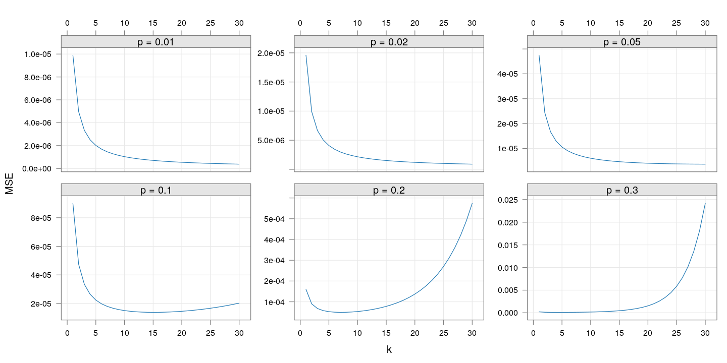
Given the risk of making $k$ too high if the true value of $p$ is more than 10%, it seems reasonable to choose $k$ between 10 and 20.
Take-home message
The actual optimization problem will have to be formulated depending on the practical constraints. But ultimately it boils down to choosing an optimal value of $k$ and $m$ given other constraints, and the following observations will hold generally:
-
The optimal choices of $k$ and $m$ will depend on the true unknown $p$ (so they will have to be chosen based on some guess about $p$).
-
For a given $p$, the mean-squared-error (MSE) of $\hat{p}$ is as good a criterion to minimize as anything else (although it might not be the best criterion when comparing different values of $p$).
-
The explicit expression for the mean squared error, although valid only asymptotically, seems to be in good agreement with simulated results. This makes the optimization exercise fairly simple.
-
Simulation is still a useful tool to anticipate extreme behaviour not reflected by the mean squared error alone (such as $q$ becoming too high).
Of course, we will not know $p$ in advance, and $p$ will also change over time as the infection spreads. Generally speaking, taking a fairly high $k$ (maybe around 20) would seem reasonable for a pilot study, with further refinements in subsequent rounds.
Once a value of $k$ is fixed, the precision will naturally increase with $m$, the number of tests performed. A reasonable value for $m$ (which will depend on $p$) can be chosen based on some plausible values for $p$ and the desired precision.
Confidence limits
Although not directly relevant for choosing $k$ and $m$, it is important to consider confidence limits rather than point estimates when trying to estimate $p$. In this scenario, it is more important to have a lower confidence limit than an upper confidence limit (overestimating $p$ is not a big problem, but underestimating it could be). It is common to consider an approximate (Gaussian) lower confidence limit. An “exact” limit is also possible, although it is slightly slower to compute.
An R implementation of both are given for reference (Click here to show / hide code.)
normal.lcl <- function(t, k = 1, m = 100, level = 0.95)
{
    ## Approximate (Gaussian) confidence interval for p when
    ## - k swabs tested in each group
    ## - m such groups (for a total of n=k*m individuals sampled)
    qhat <- t / m
    qlo <- t / m + qnorm(1-level) * sqrt(qhat * (1-qhat) / m)
    1 - (1-qlo)^(1/k)
}
exact.lcl <- function(t, k = 1, m = 100, level = 0.95)
{
    ## Exact (binomial) lower confidence limit for p when
    ## - k swabs tested in each group
    ## - m such groups (for a total of n=k*m individuals sampled)
    pval.shifted <- function(p0)
    {
        pbinom(t, m, 1 - (1 - p0)^k, lower.tail = FALSE) - (1-level)
    }
    lcl <- try(uniroot(pval.shifted, c(0, t/m))$root, silent = TRUE)
    if (inherits(lcl, "try-error")) NA else lcl
}
Simulation of lower confidence limits
$m=1000, p=0.01$
The following plot shows the approximate lower confidence limits in the same setup as above (but with $k$ only up to 40). The red line indicates the (lower) 10th percentile of the LCL values for each $k$. The “closer” this is to the true value of $p$, the more “precise” the (random) confidence limit is.
M <- 1000
P <- 0.01
g <- expand.grid(m = M, k = 1:40, p = P, rep = 1:500)
g <- within(g,
            {
                t <- rbinom(nrow(g), size = m, prob = 1 - (1-p)^k)
                lcl.approx <- normal.lcl(t, k = k, m = m, level = 0.95)
            })
xyplot(lcl.approx ~ k, data = g, jitter.x = TRUE, grid = TRUE, alpha = 0.2,
       abline = list(h = P), ylab = expression("LCL for p")) +
    layer(panel.average(x, y, fun = function(x) quantile(x, 0.1),
                        horizontal = FALSE, col = "red"))
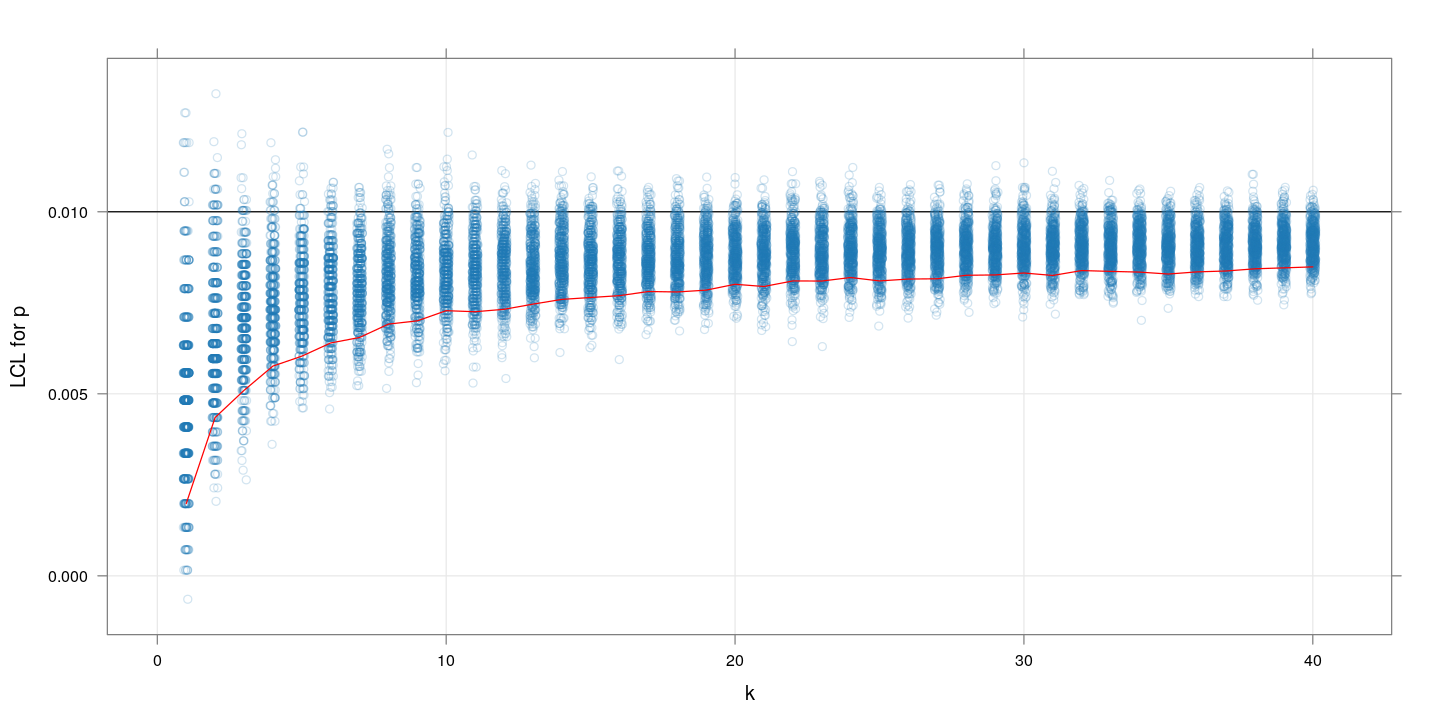
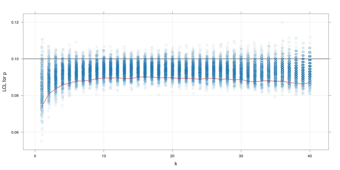
$m=1000, p=0.1$
Similar plot for $p=01$. The message is more or less the same as we saw with the MSE values: $k$ between 10 and 20 gives highest precision.
M <- 1000
P <- 0.1
g <- expand.grid(m = M, k = 1:40, p = P, rep = 1:500)
g <- within(g,
            {
                t <- rbinom(nrow(g), size = m, prob = 1 - (1-p)^k)
                lcl.approx <- normal.lcl(t, k = k, m = m, level = 0.95)
            })
xyplot(lcl.approx ~ k, data = g, jitter.x = TRUE, grid = TRUE, alpha = 0.2,
       abline = list(h = P), ylab = expression("LCL for p")) +
    layer(panel.average(x, y, fun = function(x) quantile(x, 0.1),
                        horizontal = FALSE, col = "red"))